The volume I got is number 13 from 1892. There is no full scan of it online and I intend to eventually make the whole thing available digitally. Until then, you can read the introduction from editor Robert Hilton and see the full list of contributors.
If you’d like a photo of a particular contribution, email me at jacob at this website and I’ll send you one!
Since the last volume of the Exchange was issued, the revolution that has taken place in the style and execution of British printing in the last five years has been fully acknowledged by our severest critics – our confrères of the German Fatherland. At first they regarded it with suspicion as an innovation, and were especially strong in their objections to the manner in which we use their elaborate combination borders – in selected pieces and bands and panels instead of formal four-sided borders, as has been the custom of the German job printer from the time moveable type borders were introduced.
Herr A. M. Watzulik was the first, in an article in the pages of the Swiss Graphic Journal, to recognise the new style and point out its advantages. His descriptions and illustrations led to animated discussions amongst German printers, and one by one all the trade journals of the Fatherland took the matter up, many of the ablest German and Swiss printers taking part in the discussion. Extracts from some of these appreciative papers have been printed in recent issues of THE BRITISH PRINTER, and to make the record complete in the volumes of the Specimen Exchange also, as well as to emphasise the hints to be learned from its criticisms, we append a few extracts from a second paper which appeared recently in the German Graphic Observer, from the pen of the able editor. “The fame of English fancy job work is not of many years’ standing: the foundation of it was really laid in the office of THE BRITISH PRINTER, a journal whose influence over English fancy jobbing is without parallel. “The extremely elegant appearance of English job work is in large measure due to the excellent paper and cards employed. The surfaced and plain material for cards, programmes, &c., is always of good quality and clear in colour. In addition to purest white, surfaces of soft rose, azure, ‘apple’ green, and ‘primrose’ yellow tints are especial favourites. “The second point in which this English work contrasts so favourably with the German is the print, which is without exception faultlessly clear and clean. This, it is true, may be partly accounted for by the entirely new types, but such clearness of types, ornaments, and rules can only be attained by hard-packing make-ready and very careful preparation. “The schemes of colour, too, differ widely from most of the German work. Black, the favourite colour with us, is seldom to be found in these English specimens. We have only come across pure black twice, and these only in conjunction with variegated colours. For the principal form brown in all shades is most in favour, then blue, greenish-blue, olive, and green-black. The effect of these colours on the paper (which for the most part is of a soft tint) is charming, and on a white ground they look much warmer than our cold black. Two of the variegated colours applied to tinted paper (e.g., olive and dark-red brown on chamois, red-brown and blue-green on grey-green, brown and green-black on greenish yellow, and so on) invariably give an effect which we can seldom attain with printed tints.
“Now we come to the materials used in composition. At the first glance the German jobbing compositor will, among the borders, vignettes, and types employed, recognise many old acquaintances; and on a closer inspection he will find among the ornaments but few figures strange to him. “Many of the types, too, are of German origin, as for instance the frequently employed Mikado, the Asträa, Aurora, with appropriate initials and characters, &c. The overwhelming majority, however, consists of those types which, known as ‘American,’ have not even yet been fully introduced among us, but which in all these specimens look extremely well and materially contribute to their peculiar charm. “The design and execution of the composition will appear new to most of our German jobbing compositors on account of the predilection for vignettes and the great simplicity of the composition technique. Of the vignettes, landscapes and sprays of leaves and blossoms, as well as groups of birds, are in especial favour, whereas other figures are almost wholly avoided. The great simplicity of the rules is worthy of remark, for 4-to-pica double-medium rules are almost exclusively employed. Thick and thin rules are seldom seen, and then only when directly required by the separate part of an ornamental figure. By the peculiar features of the design the composition is greatly simplified. Formal borders are very rare, preference being given to bands which either run beyond the edge of the paper or are cut off by perpendicular rules, whereby bevelling is avoided. The decoration of the border surface by a pleasing pattern or an appropriate vignette is of frequent occurrence, and heightens the charm of many of the specimens. “We will now consider in how far the English fancy job style may serve as a model to the German printer, who, five years ago, scarcely thought he would be willing to learn from his English colleagues, and had almost renounced all hope of the English ever following the Germans in their conscientious treatment of fancy job work. Nor has this latter event come to pass even now, for the English style has rather gone its own way; but it has at the same time attained a development which deserves the consideration even of our German printers. As the ornamentation is for the most part of German origin, printers have gradually accustomed themselves to treat it according to German rules. Borders in several colours are less seldom to be seen in the English work; they already pay more attention to the object to be attained by an ornament, and apply it accordingly. But, whereas many Germans had amid their ornamental elaboration lost the taste for a judicious treatment of the type, this object has been more steadily kept in view by our English brethren. Though many an error may lurk in decorative detail, nevertheless, the English printing invariably shows a much more intelligent treatment of the type than the German. In fact, the English have in no way forgotten that the printed matter exists for the type, and not for the ornament. “It was this intelligent treatment of the type which first called the attention of German jobbers to the work of their English brethren. The irregular, yet firmly deviating, ‘English display’ fulfilled the aspirations of many of our best efforts towards a freer treatment of design in fancy job work, and won on that account many friends. Now everybody is experimenting with it. It must have come to many a job compositor as a deliverance from oppressive bondage when he was taught that it was no longer a typographical sin if he, despite title rules, deviated his lines right and left as necessity demanded. Lines of equal width, with which previously no one knew what to do, and which were spread out in an unnatural way either by widening out or by addition of ornaments, are now simply moved sideways; and if this is done tastefully, and with due regard to the meaning of the text, a better effect is often obtained than by the symmetrical display. “Thus far, then, the German printers have already learnt from the English. But there are other points from which we might, upon closer consideration, derive advantage. Among these is especially to be mentioned the vignette, on which great care and attention are expended by the German typefounders, but of which German printers do not make sufficient use, chiefly because, in the first place, our compositors in the adjustment of vignettes and their connection with other decorative material are far too timid and narrow-minded; and, secondly, because they do not understand how to print them. In both we can learn from the English. “It never occurs to an English compositor to add joins artificially to a vignette; he would only make use of them when they were present in the vignette. The join, which is such a favourite with us, appears to the Englishman almost unpleasing, and on practical grounds we must allow that he is right, for every compositor and printer knows that its day is almost over. The English compositor rarely treats the vignette as a portion of a border, but almost always as a free and independent ornament. In any case he comes nearer to the conception of the artist who originated the vignette than we do, with our theoretical borders. Even when the vignette forms part of a border the compositor will separate it from the other ornaments by breaking the continuity of the border, regularly intersecting it, and placing the vignette in the open space caused thereby. “With regard to the colour used to print the vignettes, we may learn from the English that they should not be printed black in fancy job work. this black printing which has so much to answer for in the ill-success of German printers hitherto in their employment of the vignette. Contrasted with the delicate type, a vignette, even when quite finely drawn or rendered lighter by diminution, is nevertheless too heavy. Intolerable are those vignettes in black ink which show full surfaces, as for instance, those with a light-coloured picture on a dark ground, or that favourite kind of vignette, the centre of which forms a full disc from which the representations stand out in strong contrast. How very different is the effect of the same vignettes on the English work! Thanks to the print being in a mixed or broken colour, the
effect is always a highly pleasing one. Brown, green- grey and green-black, blue-green and blue-black, in lighter or darker shades according to the more or less strong drawings of the vignettes, and according as the composition of the type is kept strong or delicate, always bring the vignette into a harmonious general effect with the rest of the work. “There remains a few more particulars concerning the technique of the English ornamental composition. We have already called special attention to the fact that it is an extremely simple one, and that this simplicity partly rests on the employment of very practical rule material. In ornaments, quiet surface ornaments with grey effect are much in vogue, with which the powerful and vivid intarsia and silhouette forms, singly employed, are in strong contrast. “The question might now be discussed whether the English method of composition can be recommended for imitation, and whether it suits German conditions. We answer these two questions in the affirmative, but at the same time would lay stress on the fact that we do not imply thereby a rigid imitation. Thus especially there is a complete economy of material; everything is used up systematically; there is no need to cut up ornaments and rules if the compositor is in any measure a man of resource. A compositor who is a thorough master of his material, and who is to some extent endowed with ‘brains,’ can with the great variety of German material, and if there is no grudging of the rules placed at his disposal, also introduce a wealth of change in his work, even though the method of composition be simplified.”
In spite of their formal ideas as to the use of borders and ornament, our German confrères know a good thing when they see it. They have now studied what they call “the free Leicester style1” appreciatively, and having realised its good points are already beginning to use it extensively in their fancy job work.
Its chief feature is the simplicity of the composition and the consequent ease and speed with which designs can be put together. With the accurate “point” standard of bodies for types, borders, and rules, fully fifty per cent is saved in the time of composition, and this is acknowledged by those printers who have arranged their plant as far as possible on the “point” system. Now that the tastefulness of the new style and the economy of its working are fully recognised, it is being rapidly taken up not only all over the United Kingdom and in Germany, but in Austria, Switzerland, Holland, Denmark, Norway, Belgium, and even Italy. It has many admirers in France, and recently there have been enquiries from the United States for good men who can “design and execute job work in the free Leicester style”. Scarcely a week passes that we do not receive parcels of specimens from abroad in which the new style is conspicuously employed, the contrast being frequently enhanced by opposite pages being shewn in the old formal style. This general adoption of our ideas in typographical design and execution is very gratifying to us, who have worked so long to produce an improved state of things in the craft of Gutenberg and Caxton. But a glance through the current volume of the Exchange – undeniably good as it is all through – shows us that there is yet plenty to do in the direction of improvement. “Not all of them show the same high standard of excellence”; and though the number of poor examples becomes less and less with successive collections, there are still some who cling to old-fashioned styles of display, do not recognise the utility of labour-saving material and other improvements, and therefore do not make the progress that is expected of them. It is also gratifying to note, in looking through the current series, that a great majority of the contributors are not slavish imitators, but frequently produce decidedly fresh and original ideas of their own, a fact which tends to show that the new style is rightly named “free”. It admits of more variety in tasteful display, both of types and borders, than any other style now in vogue, and gives a new appearance to old faces when judiciously utilised. This is shewn in many specimens in the present series. When we come to the question of finish of details, colour schemes, and general execution of both composition and presswork, it is at once seen that the improvement is noticeable “all along the line”. Not half a dozen all-round faulty specimens can be found in the whole collection, though there are a few that are somewhat faulty in finish in one or the other department. Looked at as a whole, a more tasteful or a more well-finished collection has never yet been issued, and we are well content to leave the judgment on this point to the craft at large. It is now fully recognised by all who have adopted the “free” style, that its advantages in economy of working enable them, whilst giving their clients better and more tasteful printing, to make it pay. One and all say that they can get better prices, and at the same time get more pleasure and satisfaction out of their work, and are kept busier, than when they did common work only. The new style of printing has also been provocative of an eager demand for more thorough technical instruction for and on the part of the workmen, who are at last generally recognising that the improvements in labour-saving material and appliances require more study of theory and practice combined, to enable them to secure and hold good positions. This demand for instruction has led to the starting of a number of new classes this session, and an addition of over two hundred to the ranks of the students, as well as to modifications of the syllabus, by which the important jobbing branch of the craft secures a fair share of the attention of the examiners. In this increased demand for technical instruction, the influence of the Specimen Exchange and THE BRITISH PRINTER has had one effect. The examiners now include a fair proportion of questions relating to the job department2 in their examination papers, and this fact alone has had the effect of bringing more than double the number of students into the classes. In another direction our continued strong representations in the right quarters, as to the absolute necessity of the classes being provided with the requisite material for practical instruction, have borne fruit. We are just informed, on the authority of the
trustees, that a complete letterpress plant is to be provided for the new Printers’ Institute now in course of erection in the “printers’ parish” of St. Bride, Fleet-street; and the Glasgow Branch of the British Typographia has suspended its classes, and set about providing funds for the purchase of the necessary plant. At Manchester, Edinburgh, Liverpool, and the Polytechnic class, London, more or less complete material is already provided; one or two small classes receive instruction in printing offices kindly lent for the purpose; and at the Leicester class, tools and materials, up to a new Wharfedale machine and a complete stereo plant, are introduced into the class room for special lectures. All this is very encouraging for the future prospects of the craft. To return to the Exchange: more than the full number of 375 specimens asked for have been sent. Rejections have reduced the number to 361. Of these 54 are from abroad: 33 from Germany; 12 from Austro-Hungary; 5 from Switzerland; one each from Holland, Belgium, Denmark, and Turkey; and five from the United States. It will be seen that the foreign element continues to be well represented, both in quantity and quality. The serious labour troubles in Germany were the means of preventing nearly a score more of contributions to this volume. At home, it will be seen that the contributors are more generally distributed than formerly. Scotland, formerly represented by an average of a dozen, now sends more than that number from one office alone; Wales, once represented by one or two a year, now sends nearly a score; and Ireland has gone up in equal proportions – all three countries equally in quality as in numbers. The representative collections from the leading Scotch and Irish offices could, indeed, not easily be surpassed anywhere. Coming to the large remainder of purely English contributions, the succession of really well-designed, tasteful, and admirably executed specimens is really remarkable, and many of those from small offices are equally as good in every way as those from the more important and, presumably, better furnished establishments. As a rule better inks and papers are used, and a more judicious and pleasing selection of inks and papers made than in previous volumes, though there are still a few, and these not only amongst British printers, who do not see that good paper is absolutely needed for good work. In the matter of ornament there is a more general observance of the unities, and several conflicting styles of ornament are now seldom or ever mixed in one design. As a result the incongruities of former collections are in this series few and far between. There are but few ill-balanced designs, though several are spoiled by being set too full out to the paper. Some of the “collective” exhibits from well-known British offices could not be surpassed anywhere in any country of the world. With the next volume-the fourteenth-the Exchange will have run through two apprenticeships, as it were. A comparison of the first and thirteenth volumes show what an astonishing reformation has been effected in that time in British typography. The revolution in style, as well as in workmanship, has been complete. The change in the latter respect has been caused to a great extent by the rapid introduction and more careful study of labour-saving material and appliances, and the gradual extension of the “point” system; and it is a matter for regret that we have had to look almost entirely to the “enterprising foreigner” for most of the improvements in this direction. The next volume being, as we have said, the end of the “second apprenticeship in progress, we make an earnest appeal to contributors everywhere to signalise it by helping us to crown the edifice of fourteen years’ steady work, by the production of a collection that shall in the design and execution of every individual specimen be a monument to the taste and ability of contributors, and such as will show that British printers are determined to hold their own, and keep British printing in its old position of the best in the world. In order to secure this desirable end, the number of contributions required for the next volume will remain at 375, and every care will be taken to exclude specimens that do not come fully up to the standard required. We would, therefore, advise all intending contributors who are at all doubtful of coming up to the standard to send advance proofs to the Editor, who will, as usual, cheerfully advise as to any improvements or alterations that may be needed to ensure success.
THE issue of the current volume has been considerably delayed by the time lost by many contributors during the general election and press of business since, the last parcels not reaching us till December 6th.
List of Contributors to Vol. XIII
AcKRILL, ROBERT, Harrogate.
   Oldfield, Arthur, foreman.
        Do.     contributed for the
     Harrogate Technical Class.
   Fisher, E., compositor.
   Parkin, C. B., apprentice.
   Thackwray, R.
ACTIENGESSELSCHAFT für Schriftgiesserei
    und Maschinenbau, Offenbach-am-Main.
   Winkler, Reinhold.
ARCHIBALD. James, Hull.
   Pickles, J., foreman.
AUSTEN, W. G., Canterbury.
   Houlden, S.
BABINGTON, T. K., Ripon.
   Taylor, J. H.
BAILDoN & Sons, Halifax.
   Baildon, G.
   Dixon, H., foreman.
BAKER, A. W., Birmingham.
   Overton, W. H.
BARBER & FARNWORTH, Manchester.
   Daltry, E., foreman.
Barlow, W. S., Bury.
   Pettitt, E.
BELLErBY & SON, Selby.
BEMROSE & SONS, LIMITED, Derby.
   Garratt, G. H.
   Williams, A. W.
BERNSTEEN, S., Copenhagen.
BEYAERT, LEON, Courtrai.
BOOT, EDWIN S., LIMITED, London, E.C.
Bonz' ERBEN, A., Stuttgart.
BRANCH, J. E., South Hackney, N.
   Liddiard, F. E.
BRITTEN, W., West Bromwich.
   Woodhall, E.
Brooker, J., Uckfield.
BRÜDER MAGYAR, Temesvar, Hungary.
BRUNNS, OSCAR, Breslau.
BRYAN & Co., Oxford.
   Bryan, George.
   Fletcher, W. C., foreman.
BUCKLER BROTHERS, Birmingham.
   Priestland, W.
BURKART, W., Brunn.
BURT & SONS, London, W.
BURTON, T. I., Louth.
BUSHILL, T. & SONS, Coventry.
CALDCLEUGH, THOMAS, Durham.
   Glenton, A.
   Nicholson, R. A.
   Phillips, F.
CASLON LETTER FOUNDRY, London, E.C.
   Luxton, H. H.
CAXTON WORKS, Newbury.
   Purdue, T., machinist.
CHENEY & SONS, Banbury.
Davies, G. M., machinist.
CHILVER, ARTHUR, London, E.C.
   Cuthbert, E.
CHORLTON & KNOWLES, Manchester.
CHRISTOPHERS & SON, Newport, Mon.
   Morley, E., foreman.
   Morgan, E., machinist.
CLARKE, A., Loughborough.
   Wells, J. W.
COATEs & YATES, Rochdale.
   Ashmore, R. A.
   Webster, A.
COLLINS & DARWELL, Leigh.
COOPER & Co., LIMITED, Birmingham.
   White, A. H.
COOPER & BUDD, Peckham, S.E.
   Joyner, Geo., foreman.
CRAIGHEAD, A., Galashiels.
CUTHBERTSON & BLAcK, Manchester.
   Black, John
   Cuthbertson, W. S principals.
   Shadwell, J. A. H., foreman.
   Clarke. S.
DANIEL & Co., St. Leonards.
DE MONTFORT PRESS (Raithby, Lawrence and Co., Ltd., Leicester).
   Hilton, Robert
   Lawrence, J. C.
   Raithby, H. C.
   Grayson, R., foreman.
   Brown, Joseph, assistant-foreman.
   Harwood, J. H., foreman, platen dept.
   Jackson, T. W., foreman machinist.
   Brad, A., machinist.
   Breese, R., compositor.
   Bruce. J., compositor.
   Budden, C. G., compositor.
   Clarke, John S., compositor.
   Clarke. W., machinist.
   Coleman, H., compositor.
   Davis, W. W., machinist.
   Fisher, Chas. H., machinist.
   Flint, J. W., machinist.
   Graham, Jas., compositor.
   Hilton, Frank.
   Hutt, E. E., compositor.
   Luck, F.. machinist.
   Martin, W. S.
   Parker, G. A., compositor.
   Readings, H., compositor.
   Richards. A. (foreman, litho dept.)
   Stevens, E.T. D. (manager, litho dept.)
   Thomas, F.. compositor.
   Turville, W.
   Wade, W. H., compositor.
   Walkington, R. T., machinist.
   Wilson, Major, machinist.
   Whetton, H.
DENNIS, E. T. W., Scarborough.
   Jowsey, Arthur, machinist.
DOERING, C., Karlsruhe.
DOTESIo, W. C., Bradford-on-Avon.
   Glover, B.
   Harris, W.
East Anglian Daily Times, Ipswich.
   Daws, Thos. (manager, typo dept.)
EDDINGTON, E., Thornbury.
   Eddington, C.
   Hale, E., machinist.
EDDInGTON & CADBURy, Swindon.
   Eddington, W. C.
   Cousin. J.
   Dance, R.
   Docwra, G. W., machinist.
   Fulton, J. A.
   Garrett, R. W.
   Knight, C. E.
   Proctor. W. T.
EDWARDS, H., Cheltenham.
   Taylor, G. W., foreman.
ELLIOTT, P. E., Finsbury, E.C.
ENGEL, E. M., Vienna.
FITCH, OSWALD, London, E.C.
FARQUHARSON, ROBERTS & PHILLIPS, LIMITED, London, E.C.
   Webber, R. W.
FöRSTER & BoRRIES, Zwickau.
   Goebel, Paul, foreman.
FOSTER & BIRD, King's Lynn.
   Davison. J. H., compositor.
   Morgan, J. P.
FROMME, CARL, Vienna.
   Haas, Anton, foreman.
   Jochs, Edmund, compositor.
   Olmühl, Fr., machine-foreman.
FUCHS, SIGMUND, Budapest.
FUHRMANN, OTTO, Stendal.
FUSSLI, ORELL, Zurich.
GAILLARD. EDM., Berlin.
GARDNER BROTHERS, Leith.
GAZE & SONS, Strand, London.
   Lee, F. C., compositor.
GEIBEL, S. & Co., Altenburg.
GEVEKE, GEB., Hildesheim.
   Krulls, Th., machinist.
GILMOUR & CARMICHAEL, Glasgow.
   Greig. Colin.
GILLESPIE, H. G., Glasgow.
GOODNER, T. E., Midhurst.
   Witham. C. R.. foreman.
GOTELEE, A., Odiham.
   Clinker, S. H., overseer.
GRAPHO PRESS, London, E.C.
   Andrews, A.
   Collins, A.
   Fisher, W.
   Jarvis, W.
   Robinson. F.
GRIFFITH, E. & SON, Birkenhead.
GRIGG, G. W., Dover.
   Grigg, C. H.
HARPUR, T., Derby.
   Rouse, G., apprentice.
HARRIs & SoNS, Manchester.
   Harris, A. H.
HARRISON, WM., Ripon.
   Harrison, W.
   Fairley, F. J., machinist.
   Groves, J. W.
HARTLEY & SON, Attercliffe.
   Belton, G. J.
   Dobinson, T. E., apprentice.
HELLER & STRANSKY. Prague.
HEPWORTH, LEWIS, & Co., Tunbridge Wells.
   Cox, James, foreman.
HERALD & WALKER, Manchester.
HILL, S. & Co., Liverpool.
HILLMAN, T. & Co., Birmingham.
   Lucas, A. E.
HODGE & Co., Glasgow.
   M'Kirdy, Chas., apprentice.
   Smith, C., apprentice
   Brown, T., apprentice
HODGSON, J. L., St. Helens.
HOFFMANN, HERMANN, Steglitz.
HOHMANN, H., Darmstadt.
HORNYANSZKY, VIKTOR. Budapest.
HOSSACk, A., Edinburgh.
   Hossack. J. W.
HOWARTH, JOHN, Rochdale.
   Howarth, J. D.
HUGHES & HARBER, Longton.
   Dryland, Chas., foreman.
HUNT, BARNARD & Co., London, W.
HURST, ARTHUR, York.
IMP. EB-UZ-ZIA, Constantinople.
JACKSON, C. M., Woolwich.
   Jackson, C. M.
JAMES, A. C., Redland, Bristol.
JASPER, FR., Vienna.
JOHNS. R. H., Newport, Mon.
   Johns, R. S.
   Bate, F. A. M., apprentice.
   Chave, Wm.
   Gould. H.
JOHNS, W. N., Newport, Mon.
   Fussell, H. J. G., overseer.
   Clissitt, C. T., apprentice.
   Gronow, A. C.
   Watkins, A.
JOHNSON. C. H., Leeds.
   Crosland, Wm.
JONES, ROBERT, Wrexham.
   Wilkinson, J.
KARAFIAT, LEOPOLD, Brunn.
KAY & SONS, Haworth.
K. K. HOF-UND-STAATSDRUCKEREI, Vienna.
KNöFLER, H. & R., Vienna.
KREBS, BENJAMIN, Frankfort-am-Main.
LAUBNER, KARL, Essegg, Slavonia.
LEA & Co., LIMITED, Northampton.
   Beeby, W. J.
   Marsden, T. J.
   Underwood, W.
LEWIS, G. & SON, Selkirk.
   Lewis, John, principal.
   Calderwood, Dan, Joreman.
   Grieve, W. B., late foreman.
   Anderson, John, compositor.
   Henderson, Peter, machinist.
   Kyles, John, compositor.
   McLauchlan, Hugh, compositor.
   Niven, Archibald, compositor.
   Ramage, Geo.
   Scott, Wm., machinist.
   Thom, John, compositor.
   Thomson, J. W., apprentice.
LIBERTY PRESS, Wexford.
   Wood, Fred, principal.
   Evans, Chas. E., manager.
   Doyle, P.. apprentice.
   Keefe, Wm., apprentice.
   Knights, E. J., compositor.
   McGuire, Hugh.
   Shudel, Geo., machinist.
   Waterhouse, F., machinist.
   West, W. H., compositor.
LION, L., Fuerth.
LITTLE BOYS' HOME, Farningham.
   Beavis, T. S.
   Briggs, W. J., apprentice.
   Francis, G. S.
   Owen, R., apprentice.
LODGE & SON, Bristol.
   Hobbs, A., foreman.
LONG, W. J. C., Worthing.
   Long, D. E.
MARLBOROUGH, PEWTRESS & Co., London, E.C.
   Gregory, W. G., foreman.
MARTEN, B. R., Sudbury.
MASSEY & Co., Trowbridge.
MAWSON, PHILLIPS & Co., LIMITED, Sunderland.
   Munroe, S. C., foreman.
Messenger office, Bromsgrove.
   Bate, J., manager.
   Heyden, C., compositor.
MICHAEL, W., Barnstaple.
   Camp, Frank, foreman.
   Michael, P. D., apprentice.
MIDWOOD, Odo, Manchester.
   Huffey, W., manager.
MORISON BROTHERS, Glasgow.
   Dunlop, J. A., compositor.
MORTIMER, E., Halifax.
Moss & THOMAS, Hebden Bridge.
   Moss, J.
   Thomas, A. E.
MOUTON & Co., The Hague, Holland.
NAUMANN, C. G., Leipzig.
NEWMAN & SON, London, E.C.
   Hancock, H. J., foreman.
   Bateman, S. M., machinist.
   Cornelius, F. G.
NEW PRESS PRINTING Co., Hanley.
NORMAN, SAWYER & Co., Cheltenham.
OELHAFEN, Fr., Mainz.
PARNELL & Co., Grimsby.
   Parnell, G. B.
   Carr, E.
   Forman, Wm.
   Benson, J. N., compositor.
   Brown, R., apprentice.
PEARSON BROS., Halifax.
   Fielden, J. H.
PERCY Bros., Manchester.
   Chorlton, C. A.
   Fletcher. T.
   Nickson, F.
PHOENIX PRINTING Co., Birmingham.
   Williams, P. C., manager.
   Whiting, C.
PHELP BROS., Walthamstow.
   Hanson, F., compositor.
   Pitt, F. W., machinist.
PLATT, J. & H., Preston.
   PODMORE, W. H., Warrington.
POYSER, W., Wisbech.
   Poyser, W. F.
PRIES, AUGUST, Leipzig.
RABITZ, H., Solingen.
RAMM & SEEMANN, Leipzig.
RATCLIFFE, C. & H., Liverpool.
   Duncan, Alex.
   Sharples, John E.
REID, SONS & Co., Newcastle-on-Tyne.
   Gill, J.
   Tinker, J.
REVELL & SON, Manchester.
   Jones, F.
ROBINSON, R., Margate.
   Tanner, F., compositor.
ROBINSON, W., Bolton. (possibly William Robinson with the Bolton Advertiser)
   Robinson, W., principal.
   Robinson, Chas.
   Robinson. G. A.
   Mather, J.
   Orrell, E., apprentice.
ROHRER, RUDOF M., Brunn.
RYDER, R., Wednesbury.
   Wallbank, J., foreman.
SAVORY, E. W., Cirencester.
   Wray, C. G., foreman.
SCHELTER & GEISECKE, Leipzig.
SCHIRMER & MAHLAU, Frankfurt-am-Main.
SCHLEICHER & SCHÜLL, Düren.
SCHWEIZ. VERLAGS-DRUCKEREI, Basel.
   Boehm, G., foreman.
   Zickwolff, J. F., machinist.
SEVERN & SON, Heanor.
   Severn, Joseph.
SEWARDS, J., Sleaford.
SILSBURY, J. H., Shanklin.
   Silsbury, M.
SMITH, G. B., Chipping Norton.
SMITH, LEWIS & SON, Aberdeen.
   Barry, H. A., compositor.
   Fraser, R. C., apprentice compositor.
   Smith, W. & J.
SMITH'S PRINTING AND PUBLISHING AGENCY, London, E.C.
   Hall, A. W.
   Townson, E. W.
   Shreeve, A., machinist.
SOUTHALL BROS. & BARCLAY, Birmingham
      (Private Press of).
   Smith, James, compositor.
   Smith, J. H., machinist.
SOUTHALL, J. E., Newport, Mon.
   Iles, W., foreman.
SPAMERSCHE BUCHDRUCKEREI, Leipzig.
Sport and Play office, Birmingham.
   Machin, A. E., compositor.
SPONG & SON, Biggleswade.
   Green, Chas. E., apprentice.
STEPHENS & EYRE, Bristol.
STOOLE & WHITE, Hull.
   Needham, J., foreman.
STRECKER & MOSER, Stuttgart.
SWINBURNE PRINTING Co., Minneapolis, Minnesota, U.S.A.
   Swinburne, J. W., manager.
SYRETT, C. J., Manchester.
TAFT, H. D., Riverhead, N.Y., U.S.A.
TATUM & BOWEN, San Francisco, California, U.S.A.
   Holton, M. B.
   Loy, W. E.
THOMAS & Co., Huddersfield.
   Edwards, B., apprentice.
   Foster, A.
THORNTON & PATTINSON, Hull.
   Evison, C., compositor.
   Ralphs, H.
TOPHAM & LUPTON, Harrogate.
   Topham, J.
   Lupton, S. B.
TURNER, JAMES, Manchester.
VICTORIA WORKS, Forest-hill, S.E.
   Anderson, Ed., compositor.
Visiter office, Southport.
   Richardson, R., overseer.
   Langley, Ed., compositor.
WAGNERS ERBEN, Zurich.
WALDIE, J. M., Stonehaven.
   Bissett, J. C., manager.
WALKER & Co., Warrington.
   Beardall. J. E., compositor.
WALLAU, CARL, Mainz.
WEBBERLEY & MADDOX, Longton.
   Webberley, J. A.
WENDLING, DR. HAAS & Co., Mannheim.
   Boehm, Hans, compositor.
WHEELER, G. & Co., Manchester.
   Wright, H. N.
WHITEHEAD & SONS, Huddersfield.
   Jenkinson, G. T.
WHITTINGHAM & Co., LTD., London, E.C.
   Baker, W. J.
   Freeston, H.
WILLIAMS, F., Hawkhurst.
   Willard, J. G., foreman.
   Delia, B. W.
WILLIAMS, W. T., Portsmouth.
   Kellaway, J. S.
WILLS, H., Loughborough.
   Pallett, W.
   Oldham, J.
WINKLEy, MARK, 4 Southwark-street, S.E.
WISCHAU & WETTENGEL, Halle a. S.
WOHLFELD, A., Magdeburg.
WOOD & Co., St. Helen's.
   Brown, J.
   Lockie, R. H.
WORTHY, F., Battersea, S. W.
   Deacon, A., apprentice.
   Goodman, H. A.
See the note below the footnotes re: the Leicester Free Style ↩︎
By “the job department”, editor Robert Hilton means “Job Printing” – disposable printing of ephemera, advertising, packaging etc. This is the opposite of “Book Printing” – the more respected & older branch of printing. ↩︎
Leicester Free Style This was the Raithby Lawrence “house style”. More about this style in this detailed comment on Fonts In Use. Examples of this style:
Jean Midolle was a French calligrapher and graphic artist, most active in the years of 1830-1846. There is a great article at The Letterform Archive about Jean and the work behind his fonts/chromolithographs.
Here are some high-quality scans of his work. I’ve saved a copy of them to this website, just in case they disappear off the internet in the future 🧙♂️✨
The 1880s were a time of transformation in print – the birth of Graphic Design as we know it.
An all-male cast of typesetters, compositors and apprentices showed off their finest work in the pages of an international “exchange” where their prints would be seen and judged.
One remarkable woman’s work stood out in this environment.
A few of the ~350 contributions to the PISE Vol. 7
Her name was Wally Prohaska and, alone among male Artistic Printers, she was credited as a designer and compositor in her own right.
Come along on a dive into the history of women printers in the 1800s. We’ll start with Wally’s story and go back in time to learn more about the women who made her work possible.
In it, Jamie wrote that Victorian Artistic Printers were exclusively male. When I read that, I spat out my Mountain Dew so hard that my fedora fell off. Dear reader, I wiped the orange Cheeto crust from my 3-day-old stubble and bellowed a powerful Well Akshuallllllllyyyyyyy!
Now, we’re talking about the 1880s. A time when women were a common sight at the printing house… performing low-paid menial tasks. They would be the ones manually feeding paper into a printing press or working in the book-binding room putting together finished pages.
Composing moveable-type and operating the presses was men’s work, and the Printers’ Trade Union had a long history of blocking women from membership. This is what made Wally’s print works stand out: she was proudly credited as the compositor. Doing men’s work.
Wally Prohaska – Artistic Printer
We know about Wally from her submissions to the Printers’ International Specimen Exchange over the period of 1886 to 1889. Here is an example of her work:
This is strong work. It looks like there are 5 colours, with one being gold. She had to set up 5 printing “formes” that lined up perfectly. One for each colour. The ornate borders are made up of small lead elements, lined up side to side – everything is neat and there are no gaps between these elements. The visually “busy” look is typical of German and Italian printing of the time.
Wally was a compositor at the firm of her relative, Anton Halauska in the small town of Hallein, Austria. A profile of the firm in The British Printer credits her as a co-founder, having started the firm with Halauska in 1882.
If we assume that Wally was a close relative of Anton Halauska, we can look for records of her near Anton’s birthplace of Olmütz. There here is a census document in the Czech Archives that, if it is indeed our Wally’s, shows her birth date as Feb. 15, 1855.
Census document from 1881, possibly linked to Wally’s household
By the same logic, it is possible that Wally came from a family that was involved in the printing trade. There are several maps produced in that region by the lithography firm of “Prohaska a Muller”/Karl Prochaska, at around 1836.
After moving to Hallein and establishing herself as a capable Artistic Printer, in 1888 Wally received a Bronze Medal and a Diploma of Honour as part of the German National Arts and Crafts Exhibition in Munich. This was “for highly commendable efforts to promote job printing.” (as reported in “Buchdrucker-Zeitung” and listed in the official record)
Here are 3 more of Wally’s contributions to the Printers’ International Specimen Exchange (PISE):
As of 1893 Wally was still active, drawing up a map of Vienna that was printed by the Military Geographical Institute (source).
Very little is known about Wally, because the relevant original materials are in German and academics haven’t noticed how remarkable she was. I encourage you to research her on your own and add to the body of knowledge around her!
Side note: There is a word in German for “female typesetter” – Accidenzsetzerin. During my research, I only found 2 uses of that word. One was used to describe Wally.
The other use was in an 1893 passage describing this ad in a Berlin newspaper: “(female) Job typesetter seeks printing house owner for marriage. Offers under W. 33, Berlin, O., Post Office 34.”. I found it funny to consider that this could be a personals ad from Wally herself. But this is unlikely – Wally is always shown as Mrs. Prohaska in her contributions to PISE.
Women in printing: before Wally
Let’s go back in time to learn about women’s involvement in printing before Wally. All the way back to the first half of the 1800s.
50 years before Wally’s time, the most prominent women in printing were owners of print houses. They would not have gotten their hands into typesetting & presswork, but we know several of them were shrewd business operators.
Elizabeth Heard
Elizabeth’s entry into the print business was typical of the few women who owned a printing house: her husband died. John Heard owned the business and she took it on after his death in 1823. Elizabeth, who was 35 at the time, ran the business for at least the following 30 years.
30 years in business is a monumental accomplishment. If you read the history of Raithby Lawrence, one of the most successful printworks of the period (“Raithby Lawrence 1776-1876, 1876-1976” by De Montfort Press), you’ll see them constantly teetering on the edge of bankruptcy. Most people running printing business were into the craft of printing and knew next-to-nothing about finance, marketing or customer service. Perhaps that’s the secret to Elizabeth’s success: she must’ve focused on the business, while her son focused on the craft of printing.
Elizabeth lived and worked at 32 Boscowen Street, Truro in Cornwall. As was common for the time, the 4-storey building hosted her business was on the ground floor, with the 2nd floor acting as warehouse and the remaining 2 floors serving as residences. She held literary and musical ‘salons’ in her home and, throughout her widowhood, led Truro society as Cornwall’s ‘most able and amiable business woman’
Elizabeth’s obituary in the New York Evening Express from 1867 reads:
Mrs. Elizabeth Heard, bookseller, printer, and publisher of the “West Briton” newspaper in England, died last month at her residence in Truro. A correspondent of the London “Bookseller” says of her : “I know of no women connected with the book and newspaper trade who was better known and more respected than Mrs. Heard. She had carried on business in Boscowen street, Truro, for close upon sixty years, and I will venture to state that no commercial gentleman who ever called upon her but would be struck with her great judgment, her courtesy, and the desire which she ever evinced to do unto others as she would be done unto.” Mrs. Heard was the widow of Mr. John Heard, the founder of the business, and lost her husband about forty-five years ago. She was left with a youthful family entirely dependent upon her exertions. She was born in London in the year 1787, her father, Mr. Goodridge, being a successful tradesman. Her mother was from Edinburgh.
Like Elizabeth, Ann Eccles succeeded her husband George in their Fenchurch Street printing business when he died in 1838. Here is a poster printed by her firm, and a “dinner programme” submitted by her firm to the Printers’ International Specimen Exchange 37 years later.
Notice the difference in style between the two pieces. It is the progression from old-style printing (limited fonts, centre-aligned) to Artistic Printing (asymmetrical, an abundance of fonts and printers’ decorations).
We have a few more contributions from workers at Ann Eccles’ firm to the PISE. From Vol. 4 (1883):
And an example of a musical-theatre programme from 1887:
Mary Franklin of Hungerford was another woman who followed the same trajectory as Elizabeth and Ann. She took over the business from her husband in 1864 and ran it with her son until 1871. Mary’s business was not just a print house, but also a stationer, bookseller and “circulating library” among other things. This is common in the period: very few people ran a business that was purely a printing house.
An advertisement for Mary Franklin’s printing works (source)A modern photo of 2 Bridge St. in Hungerford, where the Franklins’ print shop was located (source)
Was there an waypoint between the 1840s – when women like Elizabeth Heard could run a print shop, but wouldn’t typeset – and the 1880s when you see Wally Prohaska do modern print work as compositor and designer?
Yes. In the 1860s, one woman did the pioneering work of cracking open the printing guild to women so they could work as typesetters.
In the 1860s, Emily Faithfull wanted to create ways for women to become financially independent. In Emily’s mind, the fact that marriage was a woman’s only path to financial security was responsible for women languishing in loveless marriages – or suffering at the hands of abusive husbands. If women could earn their own keep, how much better would their their life be?!
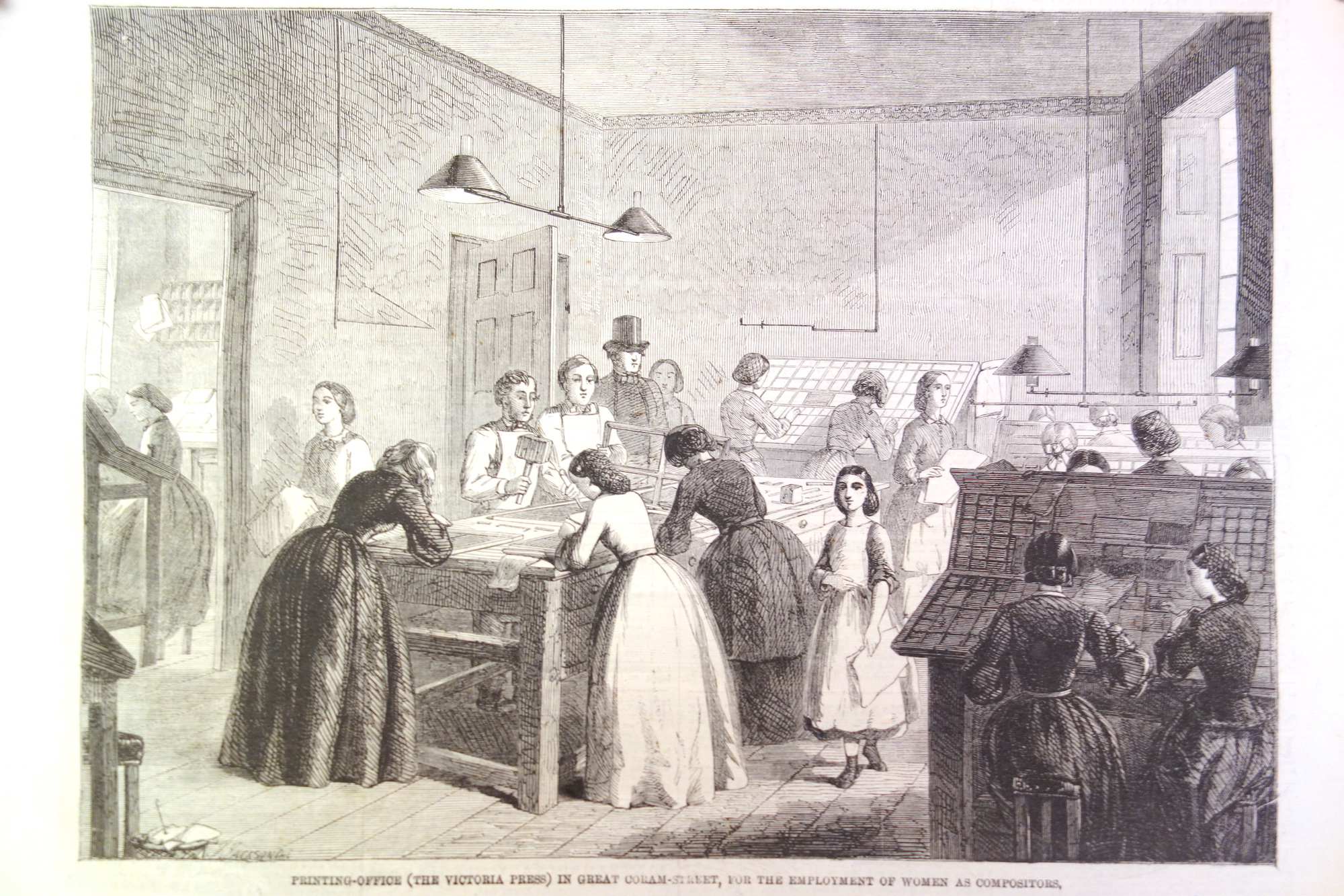
Emily’s approach wasn’t to beg politicians for change, to protest or to set fires. She had a very practical attitude. First, she researched which trades were both well-paying and suitable for women. She narrowed in on print compositing. Then, she founded a business – Victoria Press – a printing press operated wholly by women. It was a training ground for women who’d become compositors.
Emily was not a wealthy woman, but she was clever and effective at building support for her cause. She worked over the powerful Queen Victoria through flattery. She named her printworks “Victoria Press” and produced a showcase book named after & dedicated to Queen Victoria.
That showcase book was the “Victoria Regia“. Browse it to see the quality of female typesetters’ work. The initial letters and illustrations were engraved by female engravers.
Eventually, Emily Faithfull became “Printer & Publisher in Ordinary to Her Majesty”. My understanding is that this was an endorsement of Emily, just as it had been for Richard Bentley previously. (I don’t think this meant that “Queen Victoria had all her printing done at Emily’s press”. This is also separate from the role of “King’s Printer” that George Edward Eyre and William Spottiswoode apparently held during Victoria’s reign.)
Emily needed to entice ordinary women into the compositing profession. To that end, she published “Women Compositors: A Guide To The Composing Room” – a great laywoman’s introduction to the the job and the distinct tasks involved.
Finally, Ms. Faithfull carriedon a constant battle with the men of the printing guild. More on that in her own words:
But when I first attempted to introduce women as compositors, it was still no easy matter to overcome the opposition of the trades-union. As Mr. Gladstone said in his speech on monopolies, “The printer’s monopoly is a powerful combination, which has for its first principle that no woman shall be employed — for reasons obvious enough — viz., that women are admirably suited for that trade, having a niceness of touch which would enable them to handle type better than men.”
The Victoria Press was opened in 1860 in the face of a determined opposition…
The opposition was not only directed against the capitalist, but the girl apprentices were subjected to all kinds of annoyance. Tricks of a most unmanly nature were resorted to, their frames and stools were covered with ink to destroy their dresses unawares, the letters were mixed up in their boxes, and the cases were emptied of “sorts.” The men who were induced to come into the office to work the presses and teach the girls, had to assume false names to avoid detection, as the printers’ union forbade their aiding the obnoxious scheme. … Nevertheless… it accomplished the work for which it was specially designed, for compositors were drafted from it into other printing offices, and the business has been practically opened to women.
You can read more about Emily’s thinking and efforts in founding the press in Emily’s own English Woman’s Journal. Emily was a complex person. In her “Women Compositors” booklet, she exclaims that the profession “is not in any way injurious to health”, but in the English Woman’s Journal article she admits that lead and mercury vapour are a workplace hazard to print-shop employees.
Women printers at Victoria Press (source)Another illustration of Victoria Press(source)
According to Emily’s own Victoria Magazine, her efforts were successful. At around the year of 1876, a census showed 231 women employed as printers in London and about 500 others outside the city, and an additional 113 in Scotland’s main cities.
Note: in the above passage, Emily says that women printers are not prone to Wayzgooses – a printer’s term for “walkabouts” or “fun outings”. Women also don’t celebrate St. Mondays – a slang term for an impromptu holiday that printers took after drinking heavily on a Sunday!
So far, we’ve seen the top-notch typesetting work of Wally Prohaska in 1880s Austria. We went back to the 1840s, when women were entered the print industry – but only as business owners. And finally, we learned how Emily Faithfull set dozens of British women on a career in compositing in the 1860s.
Let’s go forward in time again, to 1892, and hear from two more women in print.
In 1891 William Morris was setting up Kelmscott Press (which was going to absolutely rock the world of artistic printing). At first, he hired William Bowden – a retired master printer – to be the compositor and pressman for the operation. It immediately became obvious that Bowden needed help. In a couple of weeks he was joined by his son William Henry Bowden and daughter Jane Elizabeth Bowden.
Like many women in print, Jane must’ve learned the trade from her father because of the printers’ general hostility to women in the profession. Jane, though, would go on to to become the first woman to be inducted into the London Society of Compositors. When the LSC came to unionize the Kelmscott shop, the employees insisted that they would either all join as members, or not at all:
When the Union authorities approached the men, the latter discussed the whole question, in chapel assembled, and agreed to go in as a “shop” but only as a “shop.” That is to say, there must be no discrimination against non-union men, who must go in on the same terms as the others who were already members, and also that Mrs. Pine must be enrolled with all the rest. No woman had ever yet been admitted to the Union, and its authorities objected to setting up a precedent on the point. The men stuck to their guns, however, and carried the day. Mrs. Pine duly becamethe first woman-member of the L.S.C., though she did not long enjoy the honour, as she followed her father into retirement soon afterwards, but she had made her name historic and opened the way for others.
Miss Linnett is twenty-three years of age, and has worked at the case for nearly nine years. She is the eldest daughter of Mr. J. W. Linnett, an old and experienced journalist well known in the Midland counties, and has an elder brother also connected with the provincial press. She acquired her practical training in the office of the Kettering Observer, of which paper her father was then editor and proprietor, assisting occasionally in the lighter reporting. Miss Linnett has spent the last three years in the metropolis, and is now on the staff of the Theosophical Society, at their printing works in St. John’s-wood.
Amy highlighted that while the printers’ Trade Union would technically permit women’s membership, the Factory Acts placed enormous practical limits on female printers. The Acts treated women the same as child-labour. They were forbidden to work after 6pm and past 2pm on Saturdays. A huge drawback when you’re working in Job Printing shops with unexpected “crunch times” or at a newspaper that’s typeset and printed at night.
Unfortunately, in Amy’s time – 30 years after the founding of Victoria Press – print shop owners who employed women would still face criticism. The fight for equal wages for women compositors continued:
Wherever women compositors were employed on a wide scale, male printers were unanimous in regarding them as an important cause of union weakness and of unemployment in their own ranks. In this context, it is hardly surprising the typographical unions made opposition to the use of women compositors one of the cornerstones of their trade policy. The unions were normally careful, however, to proclaim their opposition to underpaid female labour rather than to women per-se though remarks were occasionally made about the inappropriateness of women doing ‘men’s work.
“Wally” is possibly short for “Walburga”. Her last name might appear as Prochaska, Prochazka or even “Prohasta” (an OCR error, where the German blackletter K looks like the English letter T).
Mrs. M Westwood of Newport, Salop. Here is a specimen submitted to PISE vol. 8 by her employee Thomas Ralphs. It looks like Thomas is playing with the printers’ slang term “coffin” by presenting himself as an undertaker.
Many European languages have gendered forms for words, try searching digital archives for those female variants of “typesetter”, “printer” and “compositor”.
It is true that here and there women had gained a footing in printing-offices before this. It is even said that the original document of the Declaration of Independence was printed by a lady, one Mary Catherine Goddard. Penelope Russell succeeded her husband in printing The Censor at Boston in 1771; and it is recorded that she not only set type rapidly at case, but often would set up short sketches without any copy at all, “a feat of memory,” says the American newspaper reporter, “rivalling those attributed to Bret Harte while on the Pacific coast.” Mrs. Jane Atkin, of Boston, was also noted in 1802 as a thorough printer and most accurate proof-reader. Several English solitary cases might be cited, and one or two attempts — notably at M’Corquodale’s printing-offices — had been made on a small scale previous to the opening of the Victoria Press.
For more on Emily Faithfull
Emily Faithfull is well known and it is easy to find writing about her and from her.
There is a freely-available digital book about Emily Faithfull called The Caxton of Her Age. (A terrible book title – it is a reference to William Caxton)
In the 1870s, Emily Faithfull and Emma Paterson founded the Women’s Printing Society, a publishing house that allowed women to learn the trade of printing. Elizabeth Yeats studied at the Society before founding Dun Emer Press / Cuala Pressin the early 1900s.
For more abut the Victoria Press, visit The Victoria Press Circle. It is a database of the books/magazines printed there, with information about those who contributed their writings and plots of connections between them.
Emily’s sister, Esther Faithfull Fleet was an accomplished illustrator. Te Deum Laudamus is an art book illustrated by Esther, printed by Emily Faithfull. Chromolithographed by Michael & Nicholas Hanhart. My understanding is that older sister Esther painted the illustrations on paper, they were etched on stone by the Hanharts, and then Emily’s team used the stones to print colour prints and bind them into books.
The thesis above shows Eccles’ and Heard’s poster work for boosting immigration to New Zealand. In the first half of the 1800s, London was covered with a baffling number of posters. Their printing work had to stand out this environment:
Detail from John Parry’s 1840 painting, “A London Street Scene”Bills on a wall, 1888. Source.
A cute ad
I like this printed specimen of an ad from the1885 PISE. It’s an advertisement for Mrs. Kirkland’s shirtmaking business, contributed by Isaac Kirkland. Maybe he’s a husband making an ad for his wife, or a son making a flyer for his mom. Nice and heartwarming.
Amy Linnett’s 1892 profile described her as working at the Theosophical Society. If you want to go down a fantastic rabbit hole, start reading the Wikipedia page for Jiddu Krishnamurti – the “World Teacher” that the Theosophists were expecting. It has wonderful passages like:
The boy was vague, uncertain, woolly; he didn’t seem to care what was happening. He was like a vessel with a large hole in it, whatever was put in, went through, nothing remained.
Krishnamurti himself described his state of mind as a young boy: “No thought entered his mind. He was watching and listening and nothing else. Thought with its associations never arose. There was no image-making. He often attempted to think but no thought would come.”
Did you find this page useful? Discovered specimens of women’s printing you’d like to highlight? Wrote a related blog post? Reach out to me by email at jacob at this site!
When we learned about women printers from Victorian times, I mentioned that Austrian compositor Wally Prohaska worked with a business partner – Anton Halauska.
Anton’s work was quite prominent in the pages of the Printers’ International Specimen Exchange. It was punchy. Just look at this bangin’ self-portrait:
In addition to being a printer, Anton’s father ran a bookstore in Olmütz. In the year 1861, the bookstore failed and his business went bankrupt. That’s a risk that every businessman takes on. But what’s unusual is what his father did next: He lied to his creditors, pretending that he got a fresh cash investment into the business to keep it going.
English translation (from Chat GPT)
A Warning.
A domestic colleague received a summons from a notary in Olmütz dated May 17 of this year, instructing him to appear on June 3 as a creditor of the printing and book business of Anton Halauska in Olmütz, or to secure his claims through a representative.
On the same day that this summons was issued, a printed circular from A. Halauska, dated May 18, arrived. In it, he declared his suspension of payments while at the same time announcing that business would continue with new strength and under more favorable conditions. This was supposedly possible because “Mr. Fleischmann in Olmütz, who is known as a capable businessman and has significant capital at his disposal, had agreed to become his business partner.”
Since further details about the aforementioned Mr. Fleischmann were unknown, it was stated that Mr. Fleischmann was willing to provide further information if requested via Mr. Braumüller in Vienna.
Believing that an amicable settlement was preferable to legal proceedings, the recipient of the circular from A. Halauska was inclined to trust its claims. However, as a precaution, he contacted Mr. Braumüller with the request for confirmation regarding Mr. Fleischmann, based on the statements in the circular.
Mr. Braumüller was courteous enough to reply, stating that he neither personally knew the aforementioned Mr. Fleischmann nor was he in a position to provide any details about his financial situation. Furthermore, he had already distanced himself from the circular and requested a public retraction of the statement that referenced him.
In the meantime, this correspondence resulted in the registration deadline being postponed to June 3.
The simple presentation of these facts clearly shows that A. Halauska’s circular had no other purpose than to deceive creditors, keeping them calm while preventing them from asserting their claims at the right time. Otherwise, what purpose would such a registration deadline or the recommendation from a highly esteemed colleague serve?
Such self-serving conduct does not require further commentary. It is not merely a duty but a necessity to warn against it!
Anton Jr. served one year in the army, and went on to get an eclectic education which included becoming a master stenographer (publishing a book about the subject). Afterwards, Anton wished to found his own print shop in Salzburg but was denied permission. He went on to establish one in the nearby Austrian town of Hallein with with Wally Prohaska – with doors opening on December 15, 1882.
Anton was an “Artistic Printer“, which means that he worked at the cutting edge of print design. Here is an example of Halauska’s printing:
In 1883, a year after establishing his business, Anton’ father passed away at the age of 70. Anton himself will not live to such an old age.
In Hallein, Anton invented the textured printing effect of “Selenotype”. For that and other contributions to print, he received permission to use the imperial eagle in his coat of arms and seal.
A sample of Selenotype (source)Halauska’s using the Imperial EagleAn ad for Selenotype, 1886 (source)
In 1888, The British Printerran a profile of Halauska, shown below. At this point, the talented Austrian printer’ fame has reached England.
In 1888, Anton and Wally were awarded a Bronze Medal and Honorary Diploma at the German National Arts and Crafts Exhibition in Munich (as reported in “Buchdrucker-Zeitung” and listed in the official record)
Later, in 1893, Halauska travelled to the World’s Columbian Exposition (“The World Fair”) in Chicago to represent his country.
According to a Jan. 27, 1906 issue of the Hallein Volksfreund, Halauska’s printing house carried on business in Hallein up until 1895. The business apparently moved to Hallein from Zell am See, and Anton claimed to operate in both locations. In 1896, the press finally moved to Salzburg – the original town where Anton wanted to base his business. Notably, Anton published the calendar “Der Bote aus dem Salzachthale” and “Technisches Jahrbuch für den Buch- und Kunstdruck” – a “technical yearbook of book and art printing” with examples produced mostly by Anton himself.
A short 3 years after getting married and moving to Salzburg, Halauska died from an illness. He passed away on the 8th of November, 1899 at his home at 9 Giselakai in Salzburg (source). He was 47 years old.
Anton Halauska’s last home, number 9.
In 1900 you start seeing references to “Buchdruckerei von A. Halauska’s Witwe” which is the “Printing house of A. Halauska’s Widow”. Augusta may have restarted the business for a while with a partner named “Eiblhuber” or may have simply used the Haulaska name to give endorsements to print equipment manufacturers.
There’s also an academic article about Anton Sr. in Czech called “Olomoucký tiskař Anton Halauska, aneb, ze Seničky do světa”, by Stanislava Kovářová. In Střední Morava. — ISSN 1211-7889. — Roč. 14, č. 26 (2008), s. 123-128
In November 1983 a set of remarkable machines arrived at the Ontario Ministry of Education offices. These were the prototypes for Ontario’s very own computer: the ICON.
The ICON came to have lots of names: the Cemcorp ICON, Unisys ICON, Burroughs ICON and… “The Bionic Beaver”. It represents a time when Ontario was on the cutting edge. In the early 1980s, personal computers were still a new concept and there was debate on how to use PCs in the educational system – if at all. Despite the debate, the Ministry of Education went ahead with commissioned a computer to meet students’ needs.
A recent tumblr post about the ICON made the rounds online. In that post, the author relied on their memory to hand-draw “screenshots” from ICON programs, because no real screenshots exist online:
Greeting screen of the ICON (source). I believe it would also say “hello” through the built-in speech synthesizer.
The ICON’s beginnings
The ICON story started in 1982, when the Ontario Ministry of Education laid out the vision for computer use in the classroom. Computers were to be a tool for students to extend original thought: to write, compose, design and analyze. Not just as a terminal for accessing raw information. This feels like a very intelligent approach to computers.
They created the GEMS subsidy (Grant Eligible Microcomputer System) with special requirements as to hardware, Canadian content and an approach to computing that supported the Ministry’s approach to education. Only the Cemcorp consortium’s ICON computer was eligible at first. Schoolboards that bought a GEMS-qualifying computer system would have the Province reimburse 75% of the cost.
This book review from 1986 shows that not everyone was on board with PCs in Classrooms Source – Orbit 77 (1986)
Features and software
The ICONs lacked a hard drive or floppy disk – they would only work if they were connected to each other and to a “server” computer called the LEXICON (the plain box with a screen at the far left):
“Left: Lexicon server running ICON System 3.00.04 (1988) based on QNX 2.05b. Center: CEMCORP ICON 1. Right: Unisys ICON 2” (source)
Each time students turned on the ICON, it would download it’s operating system from the LEXICON server anew. At the end of a session, students could save their files on the LEXICON’s hard disk or floppy drive.
The LEXICON had a speech synthesizer and you could use the “say” command to vocalize whatever you typed.
Its standout feature was a near-indestructible trackball that was built into the keyboard.
“Left: Unisys ICON 2 at login prompt. Right: Unisys PW2 Advantage 4336DX server running ICON System 5.00.02 (1993) based on QNX 3.15g” (source)
Crosscountry Canada (Crosscountry on Wikipedia) (Possibly) Ernie’s Big Splash Ambience Map Manoeuvre Mathrace (re-release) Mathville (2 disks) Measuring II (2 disks) Melody Manipulations (re-release) Menulay II (2 disks) Micro News (re-release) Mind Your Own Business Musica Musicland (re-release) Music Toolkit New Frontiers (2 disks) New Kid In Town The Number Place (re-release) Ambience Offshore Fishing On My Way (5 disks) Putting Yourself Together Puddles to Pondwater QSPREAD Ambience Queues Quiz ‘N Art The Rebels Refugees in the Wilderness (related , related – and pdf local copy) Robot R & D Subdicion Planner Time Manager Tour of the Universe Ambience Treasure of Ile Madame Ambience Two-file Merge Ambience United We Stand Ambience Upstairs-Downstairs (a maze game) OESS The Voyages of Columbus (2 disks) Watfile/Plus What is Weather (2 disks) Wpro Yes and No Ambience The Academy (2 disks) Adventure Ontario (4 disks) Animals/Garbage Watfile Databases OESS Art Treasures; Unusual Countries
Ambience Array Game Astronomy A Week in the Life of … (2 disks) Ambience B.C. Lumbering Build-a-Bird Build a Land Bird Build a Shore Bird Canadian Shield Railway Ambience Cargo Sailer OESS Cattle; Contributing Canadians Choices Jr. Cloze Encounters Unlimited (4 disks) Computer Type Ambience Data Classification Dynamap (2 disks) Eco-Island English 1 (5 disks) Explorer Finding Our Way Foodfare (2 disks) From The Apple to The Moon Geometry Mart OESS Get Ready For Math Greenhouse (re-release) Greenhouse 3 / LA Serre 2 The Golden West (2 disks) Imagine (re-release) Ambience Infoschool Interail (5 disks) Ipaint II+ Italk IZZIT Storymate Resort Development Simulator Mathville (re-release ) ( 2 disks) Money Market Mindflight Bundle Admin and Utilities Mindflight Bundle (6 disks) Mindflight Bundle Tools for Schools
OESS Moving Words Cadtutor Update Alice: The Personal Pascal Electric Chemistry Building, Phase II (3 disks) OESS Casi Accounting Function Worshop (2 disks) Electric Chemestry Building (2 disks) QNX CADTutor Electric Chemistry Building, Phase III (4 disks) Business Development Simulation (2 disks) Unisys Icon System Software Release 2.25 Rev 3 Jobs for You OESS Know Your Numbers OESS Know to Add OESS Learn to Count OESS Learn to Subtract OESS Learning Game Generator Life in New France Longhouse (2 disks) Conduct – Camp System Diskette Conduct – QNX Version Conduct – Ambience Version Choices Jr (DOS Version) (2 disks) Computer Architecture (re-release) (2 disks) Chemistryland (re-release) (2 disks) Decide Your Excellency Intuitrig (re-release) Ipaint II Let There be Light (2 disks) Keep It Running – Rally Keep It Running – Garage Lemming Count The Sheridan Prewriter Ambience Sequential Search (Possibly)Northwest Fur Trader or Voyageur
“The Ambience” was a user-interface designed to improve the use of lessonware on the ICON computer. That’s why so many of these programs have the word “Ambience” in their name.
You can get an idea of what the PC revolution felt like for a class of Grade 1 students from this wonderful ethnographic study of the ICON from 1989. The report goes into the details of some of the educational programs on the ICON and dives into childrens “fuzzy exploration” of computers – which didn’t always square up with a Government Minister’s ideas of computer use.
The ICON was an expensive project and, because of the strict educational requirements for software, it wasn’t appealing for commercial software development shops – every piece of software had to be commissioned by the government.
By 1987, some of the shine was off the ICON:
…the Icon, which was supposed to be a new specialty in the economy of Ontario when it was introduced, is now produced in Taiwan. One wonders about some of the rest of the program.
For example, I had discussions with a hands-on, very informed principal in my own school system in Hamilton, who had developed for his own school, prior to and during the Icon program, a very impressive delivery program which cost about $6,000. When the Icons were awarded to him, the cost was $35,000 for basically the same operation. One wonders how much is needlessly being spent across the province on the computers in education program.
If I read this proposal by the minister correctly, it is to open up the accessibility of the computer program to all sorts of hardware and software deliverers. In that sense, it will undoubtedly economize the system, and I am grateful for that. But I remind the minister that persons as eminent in science and technology as David Suzuki have recently written very sceptical things about the presence and place of computers in education.
Towards the early 1990s, there was a lot of software that was only suitable for the ICON and hadn’t been adapted to the popular IBM Compatible PCs flooding the market. The ICONs were underpowered compared to mainstream computers. Gradually, rules for GEMS were loosened so more vendors could qualify. Schools were buying computers outside the GEMS program (which meant no subsidy). A cross-compatibility platform for ICON software called EASI (Educational Application Software Interface) was started but seems to have never materialized.
In the end, PCs found a permanent home at schools and highschools in Ontario. These weren’t the educational ICONs, but rather the general-purpose Mac and Windows machines that ended up in Canadians’ family homes. The story of a made-in-Ontario computer came to a close.
In a way, the story of the Icon is a recurring theme of Canadian anti-competitive and anti-market behaviour. In order to accomplish an audacious goal, we create a consortium of organizations (CEMCorp) and essentially give it a monopoly over a product. In this instance, it is the Liberals calling it out in 1983:
Here you will learn how to do “fuzzy matching” with the Apache Hop ETL platform. Our challenge will be to take 2 sets of grocery products from different vendors, and to match up pairs of products that have similar names.
First off, we will be working on these example files:
The examples were created in version 2.9.0 of Apache Hop.
Next, you’ll need to download Apache Hop (get the .zip file with the highest numbered version). Hop requires the Java Runtime to run on your computer – I recommend getting the free “Adoptium”. I’m assuming that you already know Apache Hop basics and will focus on Fuzzy Matching in particular.
The musical accompaniment to our adventure is the album “Born in Fire” by the band Sacred Skin.
If you like this you’ll also like Gunship, Carpenter Brut and Vandal Moon.
Fuzzy matching example
We’re starting with 2 CSV files of grocery products. 01-main-stream-TnT.csv contains products from a Canadian grocery store called “T&T”. Here’s a sample:
And the file 02-lookup-against-Galleria.csv has products from another grocer called “Galleria”:
The T&T file is missing a “UPC” (Universal Product Code) which is an important product identifier. Galleria’s products have that code. If only there was some way to get the codes from Galleria’s products and add it to the same product on the T&T file…
Fuzzy matching to the rescue!
Our goal is to add UPC numbers to the T&T products by matching with the same products on the Galleria list. The product names are different between the two vendors: which is why we need to perform an approximate match – a “fuzzy” match.
Because each product also has a “unit size”, I did some pre-processing of the data by lowercasing all text and joining the product name and unit using an @ sign. The composite column we’ll be fuzzy-matching is called “matchagainst“.
That means that a product called “Aroy-D Canned Jackfruit” with a 565 g unit size, is transformed into the string "aroy-d canned jackfruit@565g"
Our overall approach will be to take the T&T products, ingest 1 at a time, and then try to fuzzy match it against the Entire Galleria set of products. Over and over for each individual T&T product:
We will use 2 Apache Hop pipelines for this. One “parent” for ingesting each T&T product and a second “child” for matching that T&T product against the entire Galleria CSV.
The final output will look like this:
(Each row lets us match the “currentProduct” from T&T to the “upc” from Galleria.)
Child pipeline
Let’s look at the fuzzy-matching pipeline that does the main job. It is in the file fuzzymatch-each-product.hpl. The parts of the pipeline are labeled and explained below:
1. Get the “current” T&T product name
This pipeline will process just 1 T&T product name at a time. The Parent Pipeline will pass that product name to us through a variable – and step #1 is a “Get Variables” transform to get that value from the parent.
Note: we don’t need to ingest the whole T&T CSV file just to test this pipeline. We can run this pipeline with 1 default value for our variables. Just click anywhere on the pipeline canvas, click “Edit Pipeline” and you’ll see 2 variables (aka Parameters) that are pre set with default values. Here are the default values I had set in the sample child pipeline:
2. Ingest each Galleria product
Label 2 is a “CSV File Input” transform. It loads the list of Galleria products. We will compare each product with the single T&T product we’re fetching from the variable defined above.
Click “Get Fields” to detect the fields in the CSV file. It’ll try to set the column type to Integer (for SKU) based on the data, but for our case it is OK to just set everything to String for simplicity’s sake. You can also set the length to 20 characters for every field.
What’s going to happen with this pipeline is that it is going to read in the Galleria CSV and run each Galleria product through the entire pipeline. Each one will be fuzzy-matched against the 1 T&T product that remains constant (in a Variable) to see if we have a “match”.
3. The fuzzy match step
Our aim for the Fuzzy Match step is for it to output only the best matching of the Galleria products for our 1 T&T product.
Setting up the Fuzzy Match transform is so tricky that it is the main reason I wrote this post.
Here is how to navigate the Settings:
Lookup transform – this is the source step that contains the long list of potential items that we’re trying to match our 1 value with. In our case, this is the list of Galleria products with UPCs.
Lookup field – the specific field that we’ll fuzzy-match against. This is coming from the step in the “lookup transform”. In our case, it is our Galleria “product name & unit size” composite value.
Main stream field – this is the 1 main product we’re working with. In our case, it is the T&T Product that comes from the variable currentProduct. (Note that we have a special “fetch variable” step that has turned the variable into a “field” that we use here)
Algorithm – the fuzzy-matching algorithm we’ll use to find the best approximate match between our 1 T&T Product (in any given run of the child pipeline) and the many Galleria Products that we’re comparing against. The algorithms are listed and explained in the Apache Hop docs for Fuzzy Match. Your options are:
Levenshtein
Damerau Levenshtein
Needleman Wunsch
Jaro
Jaro Winkler
Pair letters similarity
Metaphone
Double Metaphone
SoundEx
Refined SoundEx
Get closer value – when this checkbox is TRUE, the fuzzy match will only get the closest matching product name from the available options. If the checkbox is FALSE, it’ll return a list of all products that have a similarity above the threshold you set, concatenated with the “Values separator” you provide.
Minimal value – the minimum similarity between 2 product names that you’ll consider a “match”. Remember that a value of 1 means “The 2 strings are identical” and less-than-one loosens up the conditions for what qualifies as a “match”.
My advice about fuzzy matching algorithms: read how the different algorithms work, and pick those that are applicable for your use case. Then, use data from your actual dataset to try out different algorithms and match thresholds. This will let you “dial in” on the settings that give you an acceptable number of false positives / false negatives.
Fuzzy matching will never be 100% accurate. You’ll probably need to do a manual quality check after your run.
Here is the second settings window and it has to do with the output values:
Match field – this is the name for the output field that will contain the actual value that was a match. In our case, it’ll be the “matchagainst” value from the Galleria values.
Value field – this field will contain the numerical “match quality” for the algorithm you pick. (see below)
Get fields – if you want to get additional fields from the “Lookup transform” then you need to click “Get fields” and include them in the output from this transform. In our case, these are the columns from the Galleria data – we’re looking for that “upc” column so that is the most critical field to have in that list.
Here’s a real example of the output from a fuzzy match step:
“currentProduct” is the T&T Product name we fed into the step. It was the same value for each of the Galleria products we compared against.
“found” is the field that actually matched on the Galleria side. Note that it is a different value from “currentProduct” but it is similar enough to match using the Jaro algorithm. The fuzzy match was successful!
“match strength” indicates how strong the match is. Here, it is an 0.885 quality match – above the 0.78 threshold in the screenshot but lower than a “1” identical value match.
All the fields here were pulled from the same row in the Galleria CSV as the product that fuzzy-matched.
This step is another “Get Variable” transform step that grabs the T&T internal product ID (the “SKU”) from the parent pipeline, and puts it into the output stream after our Fuzzy Match.
5. “Copy rows to result”
The last step is “Copy rows to result”. It’ll pass all our “child’s” data to the parent pipeline: the T&T Product identifier “currentProduct”, the T&T SKU (a T&T-specific product identifier) and all the data for the matching Galleria product.
Because our Fuzzy Match transform is only fetching the 1 closest match for a given T&T product, we are also passing just 1 row of results to the parent pipeline.
At this point you can click the ▶️ icon on the child pipeline to run the fuzzy match against our 1 default product that’s set as a variable.
Parent pipeline
Let’s look at the “parent pipeline” that iterates through every T&T product and feeds them into the fuzzy match “child pipeline”. The Parent pipeline is in the file parent-pipeline.hpl and it looks like this:
What it does is read the T&T products from a CSV file; sends each product to the child fuzzymatch-each-product.hpl pipeline; and writes the output of all the matches into another CSV file.
The trickiest parts are in the middle Pipeline executor transform. In the settings, I am setting up 2 variables – “varCurrentProduct” and “varCurrentSKU” that will contain the T&T product name (from the .csv input field “matchagainst”) and the T&T SKU. These variables will be available to the Child pipeline through Variables:
The Child Pipeline’s values for these variables will change on every execution, with every row of T&T data.
Additionally, when you SHIFT-drag from this “pipeline execute” step to connect it to the CSV file writer, you’ll see 5 different options for the kind of data you want in that stream. Choose “This output will contain the result rows after execution“
The different types of output will result in the below values outputting to disk:
Final result
You perform the entire fuzzy match for all products by clicking the ▶️ icon on the Parent Pipeline parent-pipeline.hpl
I ran the Jaro fuzzy-match with a match threshold of 0.78 and here are the results I got. Successful matches are marked in green, false-positives in red:
You can see that, for example, “red curry” on the T&T product and “coconut milk” on the Galleria side are considered a successful match. This is too loose – I don’t want matches like these. So we need to raise the number for our match threshold.
Most of the accurate matches in green have a “match strength” value above 0.86 so that’s going to be the new “minimal value” for the Fuzzy Match step. The re-run results look like this:
Much better!
But there are still a couple of products that aren’t exactly the same. We can catch this with a manual review…
Tips
Apache Hop has a very quirky user interface and an odd mental model. Here are a few tips as you adapt my sample files to your use case:
Error reporting
Use the “Metrics” and “Logging” tab at the bottom of the canvas to see what went wrong with your pipeline run. Error messages will appear in “Logging”.
Detail-level for error messages
If you need a greater level of detail in your error messages, when you do a “full run” you’ll be prompted to set the granularity of the log messages:
Data snapshots at each stage of the pipeline
In every successful run, you’ll see these “data table” icons appear next to many Transforms on your canvas. Left click on that tiny icon to see an immediate preview of the actual data at that step. (If your step doesn’t show this little icon, you can add a “Dummy”-type transform that’ll allow you to see data at that stage)
If your pipeline breaks after changing a CSV file
If your working pipeline stops working after you make a change to a CSV file, then you often need to refresh the list of fields in Hop so it reflects the latest fields in the CSV.
Go to your CSV file input transform and click “Get Fields” to refresh the list. Remember to also go to your Fuzzy Matching transform, go to the second tab that says “Fields” and click “Get Fields” there too!
Dear reader: if you are comfortable with Apache Hop and have spotted a mistake – please get in touch with me at “jacob” at this website – or write your own post and I’ll gladly link to you.
A word about “Fuzzy Grouping”
Fuzzy Grouping is where you have a set of values, and you find ones that are similar to each other through a fuzzy comparison. Fuzzy Matching compares 1 value to 1 other value. Fuzzy Grouping discovers groupings of similar values without your knowing the proper groupings ahead of time.
In our grocery example, this would be like getting product names from 7 vendors and making sure that the same products (with a slightly different name) are properly grouped together.
The basic way to fuzzy group in Apache Hop is to combine all 7 vendors’ products into 1 CSV, run it through the parent and run it through the child – so you get every product trying to fuzzy match with every other product across all vendors.
There are certain filtering steps that you can perform to reduce the repetitive work (ex. don’t compare a T&T product against other T&T products).
Here is my example of a fuzzy grouping setup:
Each vendor’s data is passed through a separate fuzzy match step that operates on the 1 “input product” from the “get variables” transform.
As data flows into the pipeline from the CSV, it is split into separate vendor paths (“Vendor switch” on the left) through a “Switch / case” transform with the following settings:
And the final output looks like this:
You can see how different vendor’s products (“match” column) are matched up to the 1 product fed into the process (“myprod”). Vendors without a matching product name result in a <null> row.
It was the summer of 2005 and the Tourism Toronto agency had just launched a new “city brand” campaign with a new logo, tagline and ad campaign for the City of Toronto.
The campaign was bland and instantly forgettable. The big bold vision of a city of insurance adjusters:
The new initiative cost $4 million and was jointly created by TBWA Toronto and Brand Architecture International, based in New York. (Both part of Omnicom).
For many years Toronto has been a best kept secret tourist destination; a result of its people’s modest character. But the media and demanding travelers have discovered this cultural Mecca and are beginning to spread the word.
And a sleepyfing TV ad:
“A city that is forever unfolding” indeed
The big international reveal came on June 26, 2005 with a 2-page ad in the New York Times. The ad had typos (“For seventeen years the Beaches International Jazz Festival fills the city of Toronto with jazz”) and promoted cultural events that had already finished by the date of publication.
The June 26 NYT Ad
Dec. 20, 2025 update: I got a copy of the infamous ad from the Toronto Reference Library’s microfilm archive!
Here it is. Click on the images to see full-size and read the text. It’s… “somehow majestic”:
This ad doesn’t stand out in the June 26th issue. The film “War of the Worlds” had a much bigger presence with more ads, and flashier ones.
In Toronto’s defence, there was an even clunkier ad for “Canada” in that issue:
Is this supposed to be a folded photograph? The dust cover of your own hardcover book?
Sludge-like advertising copy referred to Toronto as “a product of natural occurrences.”
Toronto Star, Jul. 23, 2005
The terrible new brand drove Toronto designer Errol Soldanha to create the website “Toronto Limited” to discuss aspects of the campaign. What really stung for Soldanha and others was that a New York agency was hired to develop Toronto’s public identity. Were there no Toronto agencies that could do the job?
They look like ads for a pharmaceutical company, selling a variety of prescription antidepressants.
nasty font – I first read that as Loronto (for some reason), then Joronto then Toronto finally.
It’s simplicity and lack of real explanations encourages people to find out more. I don’t think what Toronto is or the essence of Toronto can be shown to people, it has to be found.
(This one is genuinely sweet. That’s just not how advertising is supposed to work.)
The logos remind me of 1960’s municipal architecture.
Flash forward 19 years after the “very Toronto” misadventure of Toronto Unlimited:
I was chatting with a colleague (hi JB!). He was about to travel to Toronto for our on-site and he left sightseeing plans until the last moment. I joked that our city motto is “Toronto: It Sneaks Up On Ya!“
And then I remembered – we had a real-life motto that was just as bad. “Toronto: unlimited”. But I couldn’t find an example of the logo. Nowhere in Google Images or Google search. Did I dream the whole thing? Am I actually an Alzheimer-addled Uzbekistani septuagenarian who’s hallucinated a whole life as a Torontonian? (JB, if you can hear me, send help!)
It felt like the whole episode was wiped from the Internet
I put my sleuthing skills to good use and compiled what archived data was available into this page. So that everyone may know: no matter how badly you messed up at work today, it’s still nowhere as bad as
P.S. I got a kick from knowing that, when it comes to Toronto Unlimited, I’m on the same page as JT Singh – the mastermind behind Pyongyang’s tourism brand.
When it comes to the Branding world, the people doing Tourism Branding are wading in the kiddie pool compared to the people doing Pepsi’s “Grinning Idiot Rebrand” – who are plunging into the ocean’s abyss.
In August of 2024 I discovered a treasure trove of Artistic Printing from the Victorian age – the “Printers’ International Specimen Exchange” – and created a central page with every known image from it. Join me for a deeper look at the prints from that book!