In November 1983 a set of remarkable machines arrived at the Ontario Ministry of Education offices. These were the prototypes for Ontario’s very own computer: the ICON.
The ICON came to have lots of names: the Cemcorp ICON, Unisys ICON, Burroughs ICON and… “The Bionic Beaver”. It represents a time when Ontario was on the cutting edge. In the early 1980s, personal computers were still a new concept and there was debate on how to use PCs in the educational system – if at all. Despite the debate, the Ministry of Education went ahead with commissioned a computer to meet students’ needs.

A recent tumblr post about the ICON made the rounds online. In that post, the author relied on their memory to hand-draw “screenshots” from ICON programs, because no real screenshots exist online:

That post opened a window to a time when Ontario had the vision, desire and budget to be a leader in education. It’s so different from today. Today’s Ontario government is infamous for trying to make it illegal for school janitors to strike and for money-saving ideas like putting autistic children into regular classes that aren’t equipped for their needs. 1984 was an alternative reality where we could do things. Like build a computer in Ontario.
To add on to the original post, I decided to find some game screenshots from the ICON. It was surprisingly difficult as I only found these 4:


Here are some other screenshots of system applications and capabilities from The Book of ICON by John Herriott:

The ICON’s beginnings
The ICON story started in 1982, when the Ontario Ministry of Education laid out the vision for computer use in the classroom. Computers were to be a tool for students to extend original thought: to write, compose, design and analyze. Not just as a terminal for accessing raw information. This feels like a very intelligent approach to computers.
They created the GEMS subsidy (Grant Eligible Microcomputer System) with special requirements as to hardware, Canadian content and an approach to computing that supported the Ministry’s approach to education. Only the Cemcorp consortium’s ICON computer was eligible at first. Schoolboards that bought a GEMS-qualifying computer system would have the Province reimburse 75% of the cost.

Features and software
The ICONs lacked a hard drive or floppy disk – they would only work if they were connected to each other and to a “server” computer called the LEXICON (the plain box with a screen at the far left):

Each time students turned on the ICON, it would download it’s operating system from the LEXICON server anew. At the end of a session, students could save their files on the LEXICON’s hard disk or floppy drive.
The LEXICON had a speech synthesizer and you could use the “say” command to vocalize whatever you typed.
Its standout feature was a near-indestructible trackball that was built into the keyboard.

Here is an unofficial list of English software developed for the ICON, mostly copied from an untrustworthy internet stranger!
Unisys ICON software:
Crosscountry Canada (Crosscountry on Wikipedia)
(Possibly) Ernie’s Big Splash
Ambience Map Manoeuvre
Mathrace (re-release)
Mathville (2 disks)
Measuring II (2 disks)
Melody Manipulations (re-release)
Menulay II (2 disks)
Micro News (re-release)
Mind Your Own Business
Musica
Musicland (re-release)
Music Toolkit
New Frontiers (2 disks)
New Kid In Town
The Number Place (re-release)
Ambience Offshore Fishing
On My Way (5 disks)
Putting Yourself Together
Puddles to Pondwater
QSPREAD
Ambience Queues
Quiz ‘N Art
The Rebels
Refugees in the Wilderness (related , related – and pdf local copy)
Robot R & D
Subdicion Planner
Time Manager
Tour of the Universe
Ambience Treasure of Ile Madame
Ambience Two-file Merge
Ambience United We Stand
Ambience Upstairs-Downstairs (a maze game)
OESS The Voyages of Columbus (2 disks)
Watfile/Plus
What is Weather (2 disks)
Wpro
Yes and No
Ambience The Academy (2 disks)
Adventure Ontario (4 disks)
Animals/Garbage Watfile Databases
OESS Art Treasures; Unusual Countries
Ambience Array Game
Astronomy
A Week in the Life of … (2 disks)
Ambience B.C. Lumbering
Build-a-Bird
Build a Land Bird
Build a Shore Bird
Canadian Shield Railway
Ambience Cargo Sailer
OESS Cattle; Contributing Canadians
Choices Jr.
Cloze Encounters Unlimited (4 disks)
Computer Type
Ambience Data Classification
Dynamap (2 disks)
Eco-Island
English 1 (5 disks)
Explorer
Finding Our Way
Foodfare (2 disks)
From The Apple to The Moon
Geometry Mart
OESS Get Ready For Math
Greenhouse (re-release)
Greenhouse 3 / LA Serre 2
The Golden West (2 disks)
Imagine (re-release)
Ambience Infoschool
Interail (5 disks)
Ipaint II+
Italk
IZZIT
Storymate
Resort Development Simulator
Mathville (re-release ) ( 2 disks)
Money Market
Mindflight Bundle Admin and Utilities
Mindflight Bundle (6 disks)
Mindflight Bundle Tools for Schools
OESS Moving Words
Cadtutor Update
Alice: The Personal Pascal
Electric Chemistry Building, Phase II (3 disks)
OESS Casi Accounting
Function Worshop (2 disks)
Electric Chemestry Building (2 disks)
QNX CADTutor
Electric Chemistry Building, Phase III (4 disks)
Business Development Simulation (2 disks)
Unisys Icon System Software Release 2.25 Rev 3
Jobs for You
OESS Know Your Numbers
OESS Know to Add
OESS Learn to Count
OESS Learn to Subtract
OESS Learning Game Generator
Life in New France
Longhouse (2 disks)
Conduct – Camp System Diskette
Conduct – QNX Version
Conduct – Ambience Version
Choices Jr (DOS Version) (2 disks)
Computer Architecture (re-release) (2 disks)
Chemistryland (re-release) (2 disks)
Decide Your Excellency
Intuitrig (re-release)
Ipaint II
Let There be Light (2 disks)
Keep It Running – Rally
Keep It Running – Garage
Lemming Count
The Sheridan Prewriter
Ambience Sequential Search
(Possibly)Northwest Fur Trader or Voyageur
You can get a taste of these games by playing the online version of Crosscountry Canada or Ernie’s Big Splash.
“The Ambience” was a user-interface designed to improve the use of lessonware on the ICON computer. That’s why so many of these programs have the word “Ambience” in their name.
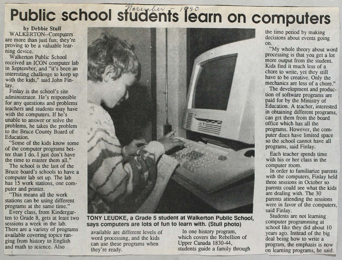
The ICON in schools
For greater detail on the ICON’s life, read the report Closing the Circle: Conclusions and Recommendations. Summative Report, Vol. 3. (backup PDF). This handy timeline is from that report:
You can get an idea of what the PC revolution felt like for a class of Grade 1 students from this wonderful ethnographic study of the ICON from 1989. The report goes into the details of some of the educational programs on the ICON and dives into childrens “fuzzy exploration” of computers – which didn’t always square up with a Government Minister’s ideas of computer use.

The ICON was an expensive project and, because of the strict educational requirements for software, it wasn’t appealing for commercial software development shops – every piece of software had to be commissioned by the government.
By 1987, some of the shine was off the ICON:
…the Icon, which was supposed to be a new specialty in the economy of Ontario when it was introduced, is now produced in Taiwan. One wonders about some of the rest of the program.
For example, I had discussions with a hands-on, very informed principal in my own school system in Hamilton, who had developed for his own school, prior to and during the Icon program, a very impressive delivery program which cost about $6,000. When the Icons were awarded to him, the cost was $35,000 for basically the same operation. One wonders how much is needlessly being spent across the province on the computers in education program.
If I read this proposal by the minister correctly, it is to open up the accessibility of the computer program to all sorts of hardware and software deliverers. In that sense, it will undoubtedly economize the system, and I am grateful for that. But I remind the minister that persons as eminent in science and technology as David Suzuki have recently written very sceptical things about the presence and place of computers in education.
Speech by Richard Alexander Allen, NDP Education Critic, June 23, 1987 (Emphasis is my own)
Note: it appears that in 1987 the Unisys ICONs were being produced by Lucky Goldstar Group in South Korea, not in Taiwan.
Towards the early 1990s, there was a lot of software that was only suitable for the ICON and hadn’t been adapted to the popular IBM Compatible PCs flooding the market. The ICONs were underpowered compared to mainstream computers. Gradually, rules for GEMS were loosened so more vendors could qualify. Schools were buying computers outside the GEMS program (which meant no subsidy). A cross-compatibility platform for ICON software called EASI (Educational Application Software Interface) was started but seems to have never materialized.
In the end, PCs found a permanent home at schools and highschools in Ontario. These weren’t the educational ICONs, but rather the general-purpose Mac and Windows machines that ended up in Canadians’ family homes. The story of a made-in-Ontario computer came to a close.
Further reading
Julian Dunn: On hacking the Unisys ICON
Jason Eckert: Ontario’s Computer: The Burroughs ICON
Jason Eckert: Ontario’s Computer Part 2: The LEXICON Server
Vintagecomputer.ca: The Burroughs ICON Computer (with lots of inside/outside photos)
Giant Bomb forums: People’s personal experiences with the ICON and more description of games.
Personal Computer Museum: listing for the Icon with comments
Anthony William Anjo: a whole site dedicated to the Burroughs ICON with lots of photos and details.
old-computers.com: profile for the Unisys ICON and a bonus page with stories of using and programming the ICON
Post Game Content: The Unisys Icon: One Canadian Xennial’s Memories of Ontario’s Obscure Computer
Wikipedia: ICON (Computer)
Dean Yergens: UniSys/Burroughs ICON – “Bionic Beaver”
Pop Rewind – pictures of old ICON magazine ads
Whatever happened to … the Burroughs Icon? at Doug Peterson’s blog – with comments
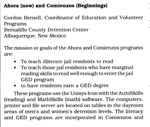
The ICON was used in a prison literacy program in New Mexico (circa 1990):
To uncover more original material, head over to the Ontario archives. They have a wealth of unexplored information and even software on floppy disks (search for Ambience, Cemcorp, Unisys and Burroughs, possibly “Meridian” as Cemcorp seems to have been a subsidiary of Meridian Technologies)
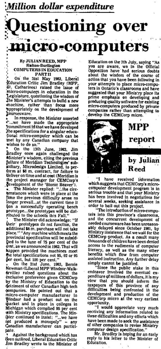
In a way, the story of the Icon is a recurring theme of Canadian anti-competitive and anti-market behaviour. In order to accomplish an audacious goal, we create a consortium of organizations (CEMCorp) and essentially give it a monopoly over a product. In this instance, it is the Liberals calling it out in 1983:
More from the blog:
- Brett and Beaver, the lost Canadian cartoon that predicted the future
- Arvid – a post-Soviet device for storing gigs of data on domestic VHS tape