
This is the biggest collection of scans from the Printers’ International Specimen Exchange. Click here to skip the story & see the images.

Imagine you’re an “information worker” in 1880.
What does that even mean when you’re in Victorian times?
Well… it looks a lot like working at a printing press.
If you are a respectable person, you’d be a member of a printers’ guild. Printing books. Boring, reliable and informed by 400 years of tradition. After all, a single printed book transmits ideas down the generations.
But if you’re someone with a bit of wild streak then you’d probably be a “Job Printer”.
Job Printers were the hacks and hustlers of the age. Their enterprise would look like 3 friends, an old-model printing press and a whole lot of metal type. They would set raised metal letters into frames (called “formes”), ink them up and make hundreds of paper impressions. Job Printers made things that were commercial, loud and disposable: advertisements, business cards, restaurant menus and posters. The opposite of books.


(source: Alexandra Hulme on flickr)

(source)
You’d be puttering along, printing posters that had the same basic layout as books did. But what if you had a niggling feeling that there was something more noble in your craft? Something that those snooty book-printers were missing?
In 1870 Oscar Harpel, a Cincinnati printer, published his “Typograph” and pointed a finger at what was missing. Superficially, this was a book of practical tips for other printers. But, at heart, it was a call to action. Harpel urged printers to add artistry to their work – to experiment with type, with layouts and the new inks that the chemical industry was inventing daily.
Those who got inspired by Harpel found it hard to reach for excellence: in a pre-Internet world, how would you even know what great printing looked like?

There were no design schools back then. And those who were busy making disposable prints would hardly even see examples of “fine printing”. That goes double for job printers who were the only print shop in an out-of-the-way provincial town: what cutting edge work were “big city printers” doing? How would you find out?
Over in the British Isles, printers Andrew White Tuer and Thomas Hailing had a clever solution.
You see, in 1877 the Brits were holding a celebration of “400 years of printing” to commemorate William Caxton’s introduction of the first printing press to the Isles. At that event, the British public was invited to see examples of domestic and foreign printing. It wasn’t pretty: British printing was visibly behind that of the Austrians.
Tuer and Hailing decided to elevate British printing through a fresh scheme called the Printer’s International Specimen Exchange: a compilation of the finest printing examples from around the world.
Here is how the Exchange worked:
- Participating printers made 400 copies of their finest work.
- Then, each participant shipped the prints to Andrew Tuer in London.
- Tuer would bind them into a book. Each book was a showcase of the finest printing across the industry.
- Finally, a copy of the book would arrive at each participant’s doorstep.
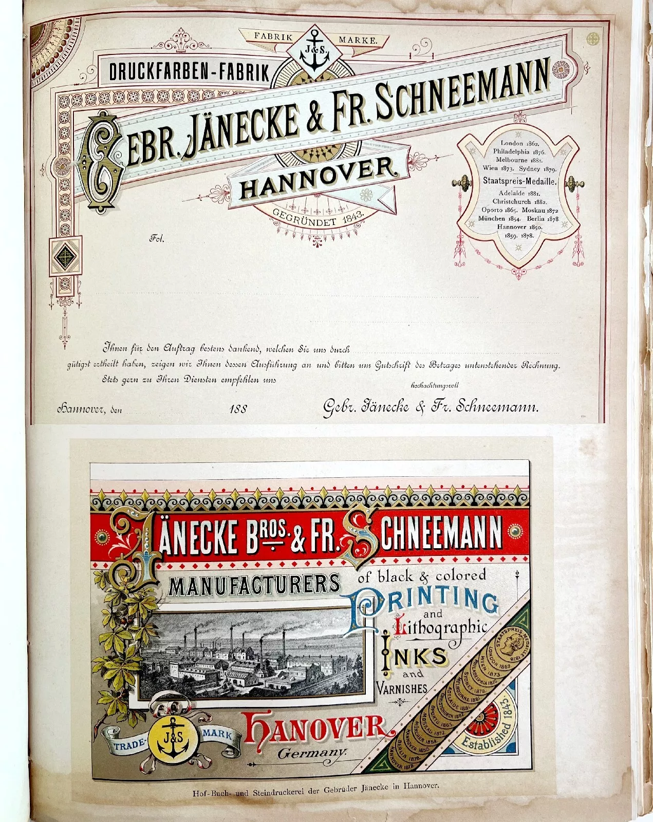
The Exchange was a wild success. Over a 17 year run, it was the central spot for fine printers to see what their colleagues are doing, to showcase their own work and to improve their skills. It catalyzed a new style called “Artistic Printing”.

Eventually, those who participated in the Exchange developed sharper aesthetic senses as they discovered the principles behind pleasing design.
Historically, the Exchange pushed printers away from the old adherence to “book printing” graphic conventions (simple fonts, centre alignment, limited inks). And it came before the time when Graphic Design became a standalone profession that eventually took agency away from printers. It marks a sweet-spot when the craftspeople making the prints were also the ones empowered to experiment and be creative.
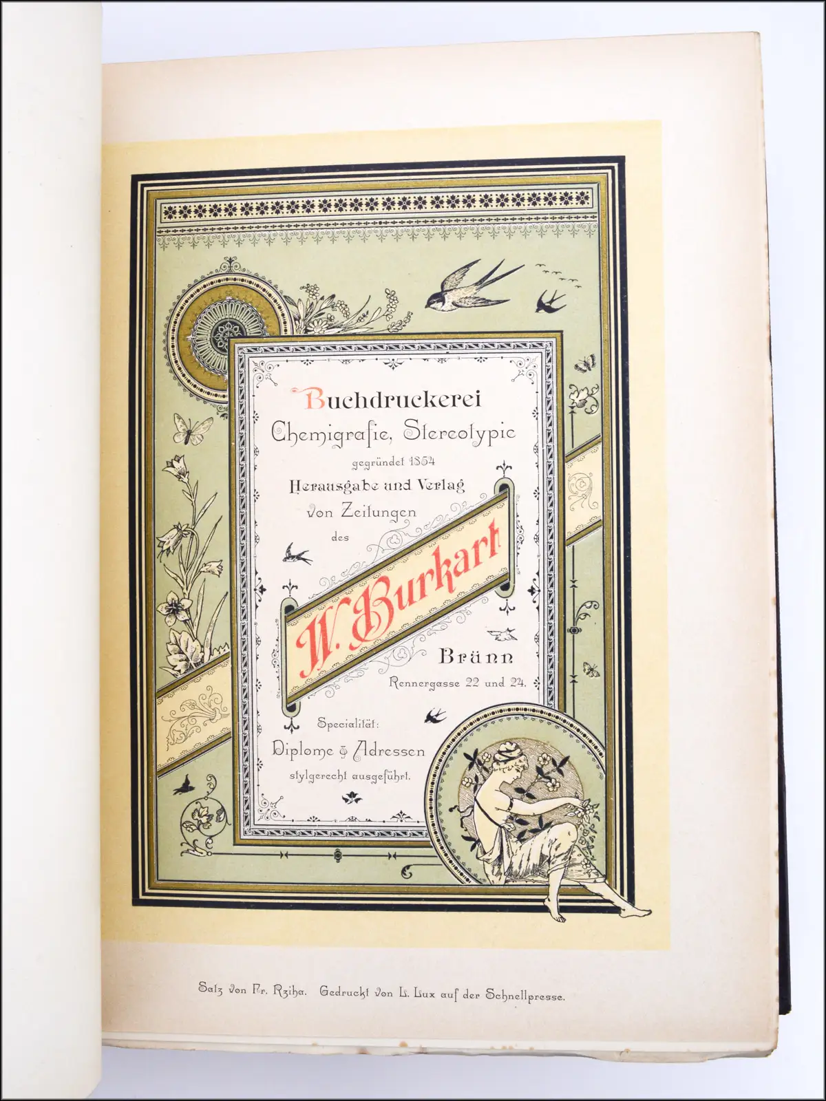
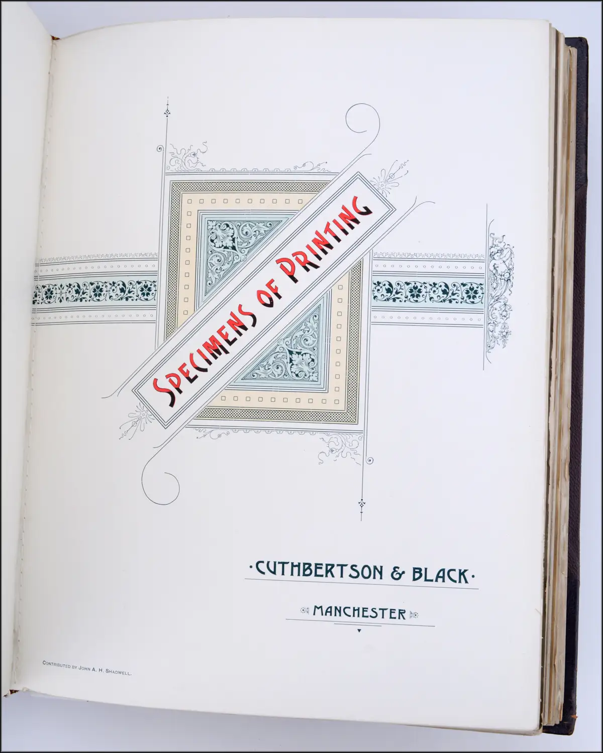
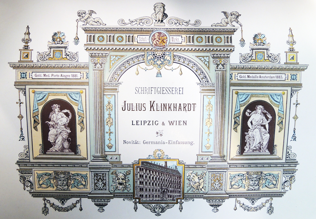
Below are all the images from Printers’ International Specimen Exchange that I could find online. They’re in the public domain so explore them with your loved ones, use them, reprint them, vectorize them.
I recommend that you start at the high-quality scan of Volume 5.
Volume 1 – 1880
Google Books PDF version digitized by Google on November 5, 2009. From a copy at the University of Michigan. [backup: same pdf on this site]


Volume 2 – 1881
Google Books PDF version digitized by Google on November 5, 2009. From a copy at the University of Michigan. [backup: same pdf on this site]


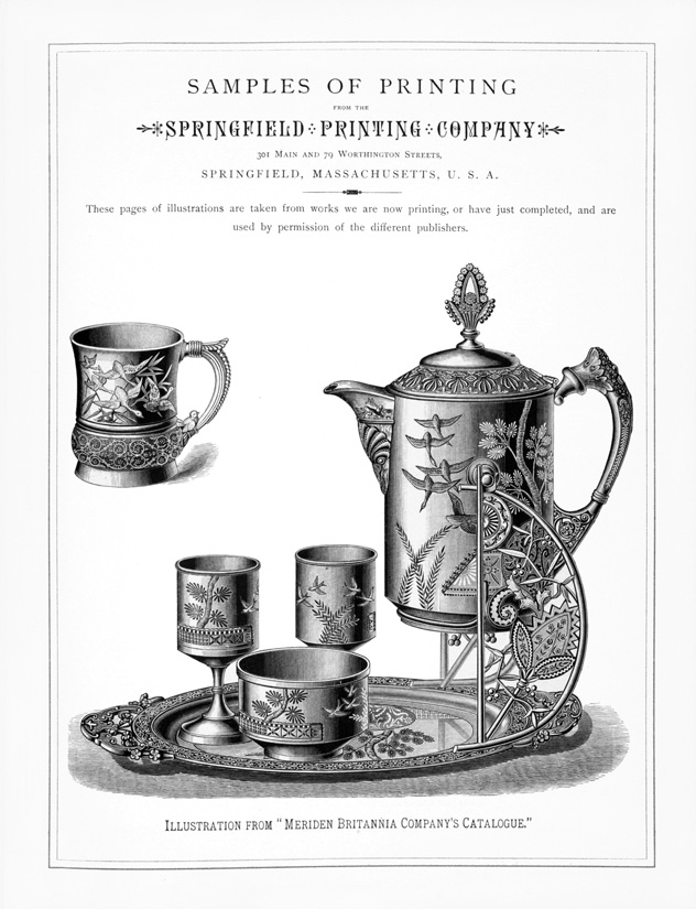


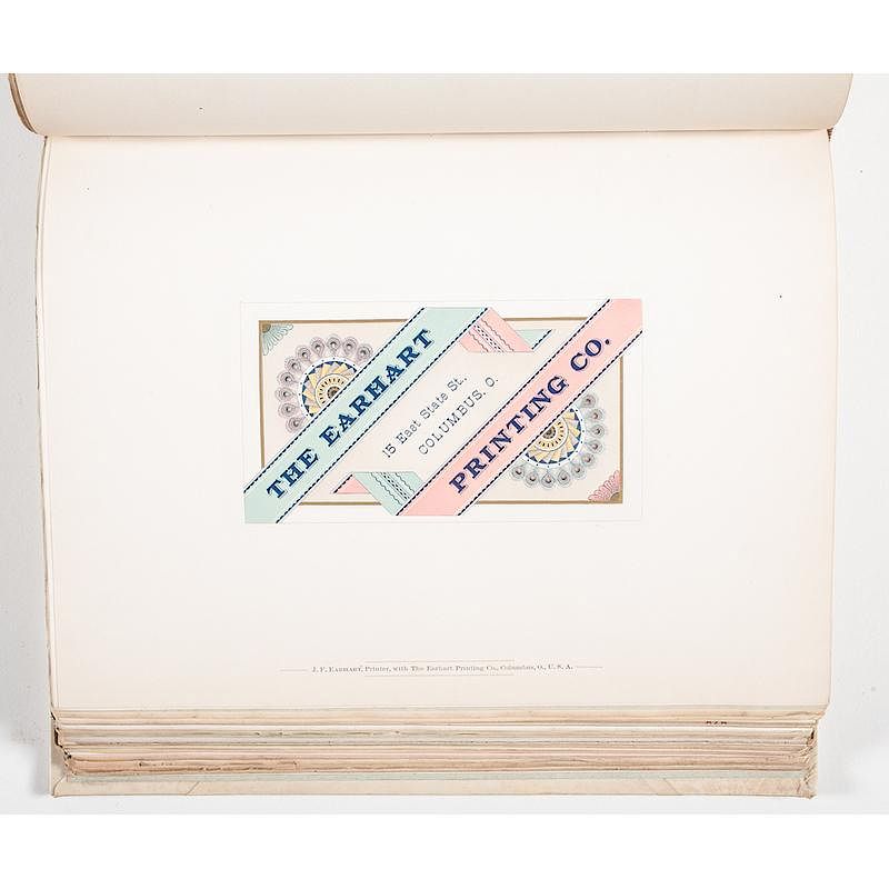
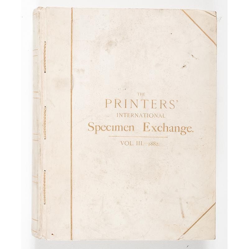
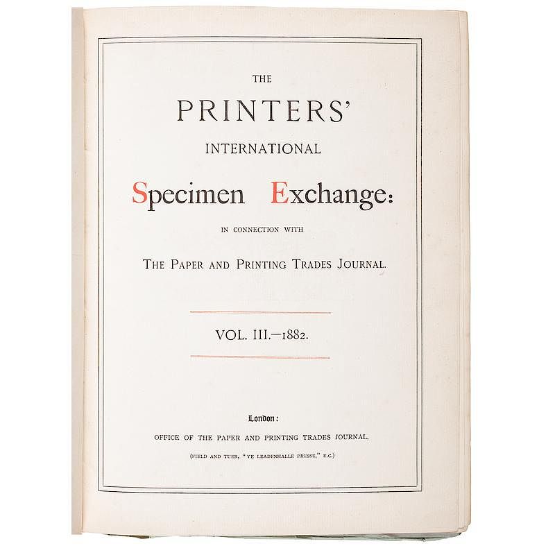
Volume 3 – 1882
No full scans online.
Could you be the one who finds, scans and uploads the first copy? 🤔


Volume 4 – 1883
Google Books PDF version digitized by Google on May 4, 2011. From a copy at the University of Michigan. [backup: same pdf on this site]


Just look at that grey marble effect!


Volume 4 contains a specimen from Boston Type Foundry that’s considered one of the finest examples of “rule work” – a picture made out of straight and bent metal rules.
Volume 5 – 1884
High quality scan: Vol. 5 from the Cincinnati and Hamilton County Public Library. [backup: same pdf on this site – 255mb]
Low quality scan: Google Books PDF version digitized by Google on May 5, 2011. From a copy at the University of Michigan. [backup: same pdf on this site]


Volume 6 – 1885
Google Books PDF version digitized by Google on May 22, 2014. From a copy at the University of Minnesota. [backup: same pdf on this site]


This volume includes a nice business card from printer Fred Wood. Those curled corners, moons and banners were made from scratch by bending brass rules. It is a strong display of technical skill.
Volume 7 – 1886
Low quality scan: Google Books PDF version digitized by Google on May 5, 2011. From a copy at the University of Michigan. [backup: same pdf on this site]


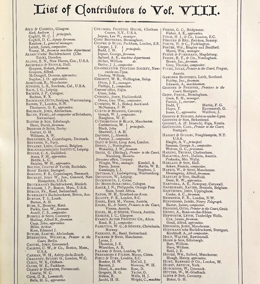
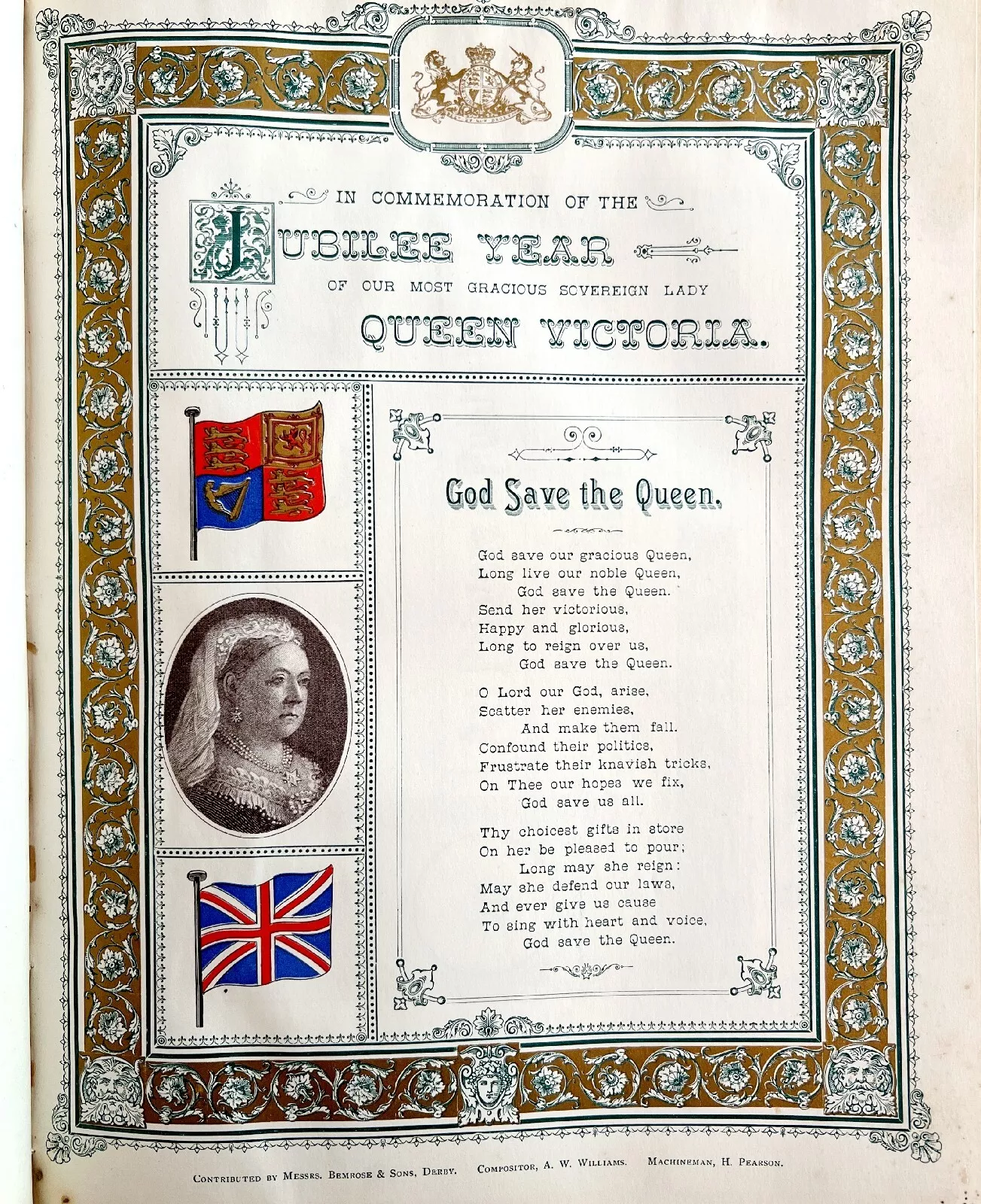
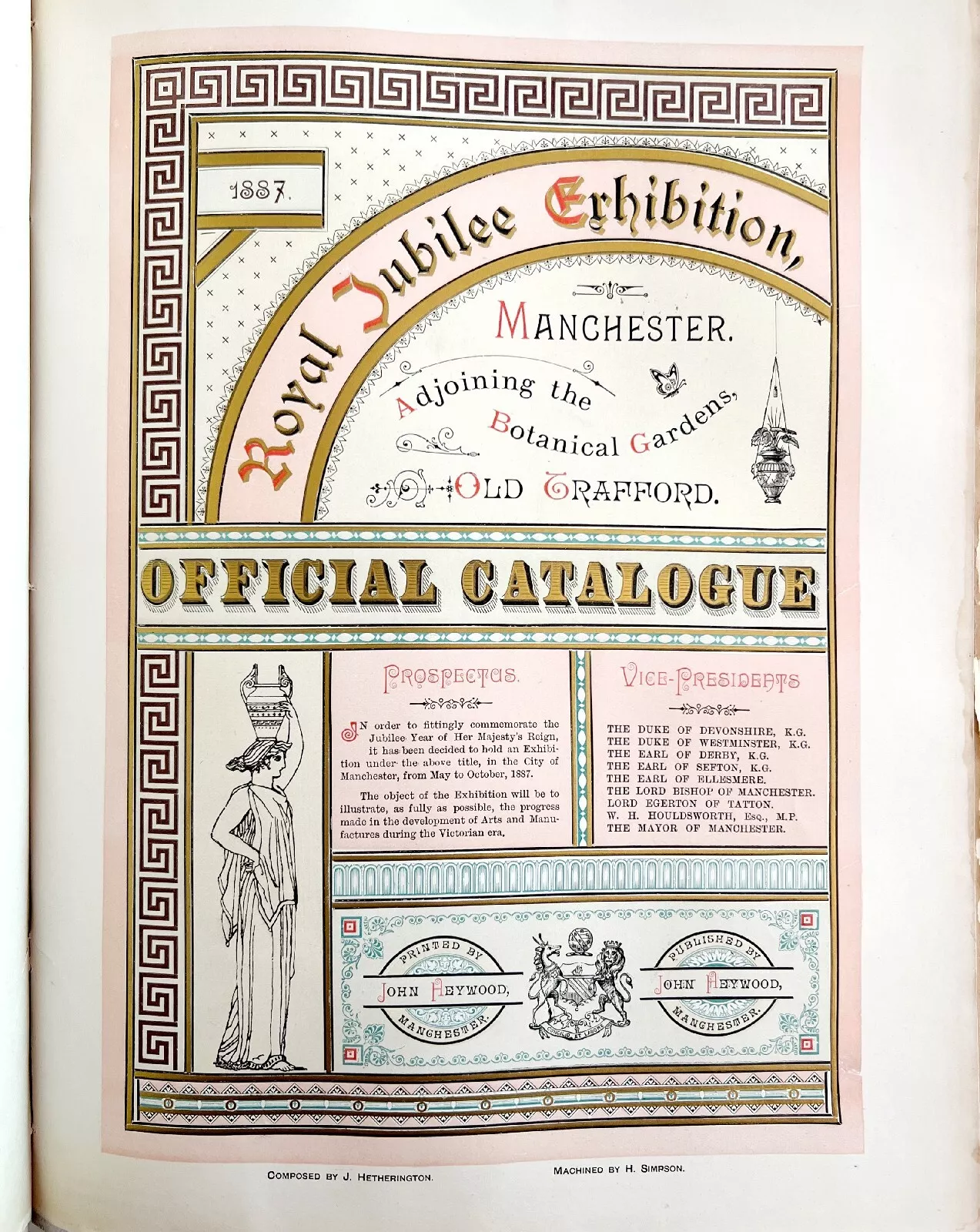
Volume 8 – 1887
Low quality scan: Google Books PDF version digitized by Google on May 3, 2011. From a copy at the University of Michigan. [backup: same pdf on this site]


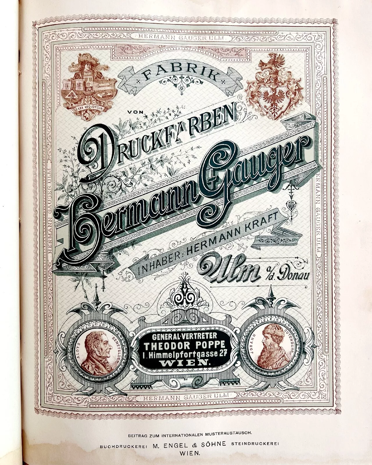


Volume 9 – 1888
Low quality scan: Google Books PDF version digitized by Google on May 3, 2011. From a copy at the University of Michigan. [backup: same pdf on this site]

Click here for a high quality version from the Berthier catalogue
Note that the illustration in the middle was made painstakingly with brass rules, not lithography or engraving.


Volume 10 – 1889
Low quality scan: Google Books PDF version digitized by Google on May 3, 2011. From a copy at the University of Michigan. [backup: same pdf on this site]


Volume 11 – 1890
High quality scan: Vol. 11 from the Cincinnati and Hamilton County Public Library. [backup: same pdf on this site – 255mb]
Low quality scan: Google Books PDF version digitized by Google on May 4 , 2011. From a copy at the University of Michigan. [backup: same pdf on this site]


Volume 12 – 1891
No full scans online.


Volume 13 – 1892
No full scans online.


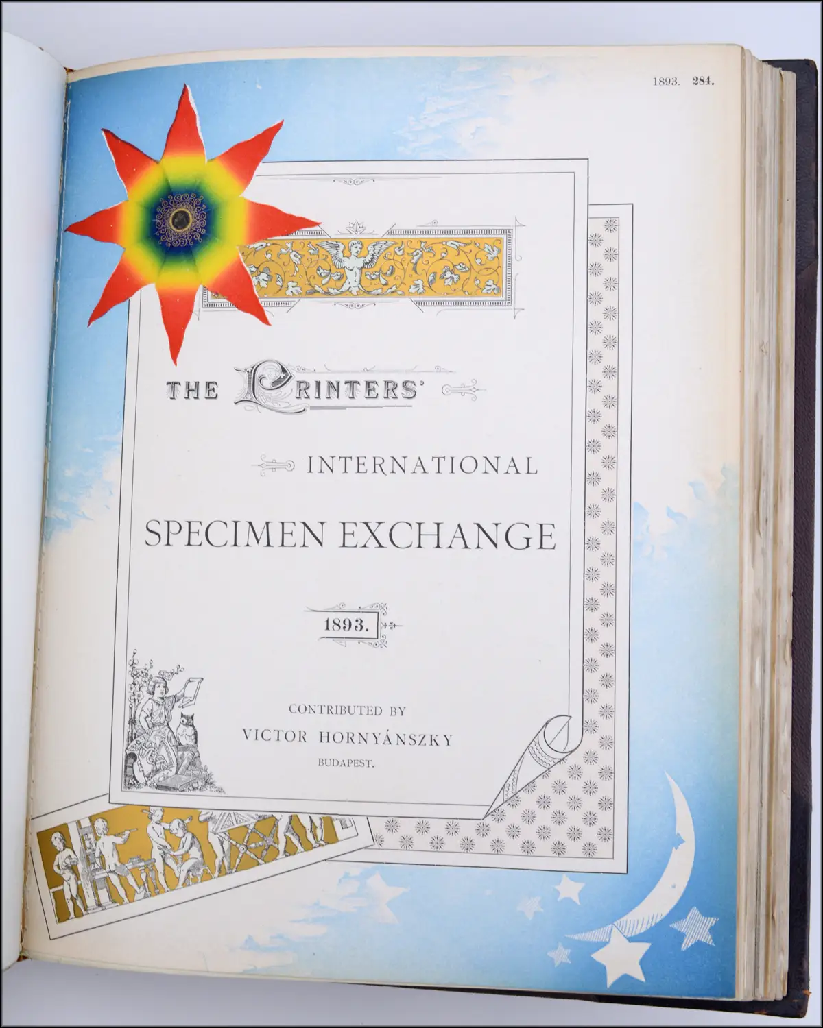
Volume 14 – 1893
No full scans online.


Note that this is an engine-turned engraving / guilloche engraving
Volume 15 – 1895
No full scans online.
Notice that it took 2 years to compile this volume, instead of the usual 1 year.

This is a beautiful example of “Chapbook style” printing – a style that was inspired by William Morris & overtook Artistic Printing


Volume 16 – 1898
No full scans online.
This was the last issue of the Printers’ International Specimen Exchange. If you’d like to see more printers’ specimens dating after 1897, take a look at The Inland Printer (American) or the trade Journal The British Printer (UK).


Head over to the next post in the series for a deeper analysis of these prints & my own hot takes!
