Category: Writing

  • December links

    “Where browser tabs from December go to retire”

    Heya, are you ready for a ride through the latest batch of random interesting stuff?

    Yeah?

    Lets go!!!

    I was reading a book from 1969 about the department store, Eaton’s. There was a reference to an “encased coin” – and it turns out that these were promotional items where a penny was inserted into a holder. Read more about encased Canadian coins here.

    (more…)
  • Jacob Eats: Crunky

    We’re always torn between who we are and who we aspire to be.

    I was a miserable kid, and I grew up to be a cranky adult. That much will not be changing.

    But, I always wish to have a higher energy level. To be crunk instead of lethargic.

    And so, you can imagine how excited I was to find CRUNKY. The chocolate bar that perfectly fuses who I am with who I want to be: crunk and cranky!

    Crunky is a milk-chocolate bar with tiny wheat puffs inside. It smells mildly like those two ingredients. On top, it has a smooth “Lotte” embossing. Lotte is a Korean company and the bar itself is made in Japan.

    At the bottom of the bar, you can see this bumpy texture:

    Those are the wheat puff showing.

    When you bite into it, there is a gentle crunch sound and you feel the texture of the puffs – a bit like Rice Krispies. This bar reminded me of a time (about 10 years ago) when I created homemade chocolate bars by melting chocolate and blending it with puffed quinoa.

    The flavour is that of good quality milk chocolate, with a little bit of a caramel taste from those toasted puffs. Everything is light. These flavours are not punchy, and they leave a mild wheat aftertaste.

    A mysterious friend of the blog tried some, and claimed they had it before. Another friend of the blog, Chad G. Petey, said that the most similar North American bar is Nestlé Crunch – made with milk chocolate and puffed rice.

    Verdict: four puffs out of five 💨💨💨💨

  • Border-Image Tool

    This tool makes it simple to create borders like the ones in Approach B and Approach C of this dual-motif border tutorial.

    Where to slice the border image:
    How to handle border-image-repeat:
    SOURCE IMAGE SAMPLE. Upload your own image using the form.

    Lorem ipsum dolor sit amet, consectetur adipiscing elit. Curabitur nisl felis, luctus in purus nec, imperdiet imperdiet dui. Lorem ipsum dolor sit amet, consectetur adipiscing elit. Fusce vitae turpis volutpat, iaculis ligula venenatis, sodales tortor. Aenean interdum consectetur finibus. Nullam quis urna non eros aliquam molestie at a quam. In quis risus sit amet nulla ornare mattis non sodales nisi. Nulla accumsan, ligula non dignissim ultricies, lectus nisi consequat elit, et congue sem nisi vel magna. Duis tincidunt scelerisque urna in pellentesque. Donec nec metus nibh. Nullam commodo, enim sed scelerisque euismod, mi quam venenatis justo, sed ornare enim nisl eu risus. Vestibulum luctus mollis quam sed faucibus. Integer mattis venenatis augue. Mauris quis ante quis ipsum ultrices dictum in ac enim. Donec dapibus ultrices molestie. Nunc elit lectus, tempor et facilisis eget, imperdiet id enim.

    Fusce dignissim vitae velit sed sagittis. Aliquam erat volutpat. Curabitur ut consequat eros. Donec sodales a nisi sed porta. Interdum et malesuada fames ac ante ipsum primis in faucibus. Interdum et malesuada fames ac ante ipsum primis in faucibus. Vestibulum et risus at tellus dictum facilisis id non leo. Proin hendrerit orci nec laoreet rhoncus. Suspendisse ac enim sit amet lorem pretium pharetra. Fusce et fringilla leo. Aenean vestibulum libero in nunc posuere venenatis sed volutpat sem. Maecenas blandit eleifend augue id porttitor. Sed egestas nec nulla lacinia fermentum.

    	
  • Abandoned

    He knew the plan went tits-up when the first nail pierced his palm.

    Father convinced him things would be simple enough:

    First, get yourself captured.

    Then, the Italians will beat you up. Your nose gets smashed. They parade you around.

    Finally, Father springs you free. Right in front of their smug faces.

    The Italians will look powerless when their victim slips free – all during the biggest celebrity execution of the year. After the locals smell the Italians’ weakness, they’ll finally get an appetite for an uprising.

    Father’s exact words were:

    IT’LL BE A CLASSIC ABRAHAM AND ISAAC STUNT

    He went along with the plan. He even put his own special touch on it:

    You see, the bounty on his head was getting stratospheric. And his little crew was always short of money. That reward money would be a boon for their rebellion: paying for weapons, food, transportation and bribes.

    So he arranged for The Boys to “betray” him and redirect the bounty right back into their own pockets.


    He set things in motion.

    Brother Jude made contact with the Italians. He told them a sob story of how he wanted out. He was done with the movement. The Italians hemmed and hawed on giving him an amnesty. But then they came up with a brilliant idea: Jude will have to betray his leader to prove he was truly out.

    Jude reluctantly agreed.


    Everything went smoothly from there.

    The Boys were having a big holiday dinner. Jude subtly pointed out their leader. The Italians burst in and slapped everyone up, including Jude for good measure.

    He was grabbed. A quick mock trial followed. There were some theatrics from their leader: weeping, washing his hands of the execution. The Head Killer oh so reluctant to kill.

    After the clean trial came a dirty beatdown. They took him into a nearby room. The Italians held him face down on the clay floor, one man kneeling on each limb. A short fat one whipped and whipped his back. His vision went red and all he could feel was pain. He was pain.

    “When will this end?”

    SOON ENOUGH, KID

    After the whipping stopped they slid a saucer of cold water near his mouth. They left him to lay there and recover.

    Then two other guys came in and started a fresh round of punching on his face.


    He woke up the next day. Eyes so swollen he could barely see through the bloody slits.

    “Father?”

    KEEP WORKING THE PLAN

    He was marched down a winding alley on full display for the townspeople. He could see so many faces, but they were all blurry. He searched the crowd for The Boys but… would he even recognize them at this point?

    Then, he spotted Jude and Thomas.

    No, not them. His heart sank.

    He was used to calling the shots. But now he’d fully given himself over to the Italians. What a mistake.

    “Father, when will I go free?”

    ANY MINUTE NOW
    KEEP MOVING FORWARD

    He kept walking and walking and hoping.

    He knew the plan went tits-up when the first nail entered his palm.

    CRUNCH

    That sound! And then came the awful pain.

    And then the other palm

    CRUNCH

    “F… F.. F. F. FUCK!!!!”

    He was hyperventilating now.

    CHANGE IN PLANS, JUNIOR!

    Eyes wide with terror. Darting left and right. This wasn’t supposed to happen.

    Then he was rising up above the crowd. The Italians were hoisting his pole. He was naked and on display and over the heads of the people.

    He hung in the scorching heat of the sun for hours.

    He could only register snippets of reality. His mother and brothers crying and saying something. Crows flying in the sky. Clouds rolling over the olive fields. He was thirsty. Going in and out of consciousness.


    With one massive effort he lifted his face up to the sun and yelled:

    “Father, why have you abandoned me?!”

    And now, dear Reader, a word about death.

    I used to be afraid of death by drowning. Think back to your time as a kid at the pool. You would dive and try to hold your breath as long as possible. Your chest would spasm, the convulsions getting more and more painful. Struggling against the body’s desire to inhale. A sour feeling all over.

    I figured drowning would be like that but even worse. Eventually my will would fail and I’d take a deep breath. But instead of nourishing oxygen, my lungs would fill with salt water. I’d be dying in pain and surprise. Alone in a watery world that’s not meant for people.

    And then I had this dream:

    I was underwater looking up. The water was a murky greenish black. I was rising towards the surface. The jittering sun and the sky could be seen through the top of the water. Maybe ten metres above.

    I was close but had been swimming up for a long time already.

    I was running out of air. Getting closer and closer to the surface. Seeing my own hand reaching up. I was getting woozy from lack of oxygen.

    Then about two metres away from the surface I died.

    That pleasant woozy feeling was all that there was.

    There was nothing else. Just that feeling. There was no longer a “me” there, so the last things I saw and those muted feelings went on forever. Eternal. Seeing the sun’s rays through the cloudy water. No rush. No fear. No thought.

    It was a most pleasant experience.

    The best dream I ever had.

    As our protagonist’s head dropped for the last time, I imagine that he felt this sweet haze forever.

    A scrape of stone-against-stone vibrated the cave.

    When the crowd pushed their way inside, their eyes came to rest on an empty stone slab. Just a few smears of blood and no corpse.

    “It’s a miracle!” they yelled.

    Bewildered faces turning to each other. Nodding and smiling.

    Through the next few years people would tell tales of how He rose and lived again. Stories of Him appearing by the fire. Him appearing on the road. Him naked by the sea when they return from fishing.

    There would be folktales about His wandering. Eventually his travels would end with Him laid to rest in Kashmir – a faraway land where lakes, mountains and sky meet.

    But the truth is that he made a choice on that slab.

    He had gone from the world.

    Winked out like a star.

  • Removing dust from 2 scans of the same page with Photo Stacking

    I recently went to scan an old newspaper ad on microfilm – and the scanner was covered in dust.

    There is a way to “cancel out” the look of dust. So I took a second scan of each page, slightly offset from the first. If we align the two scans perfectly then you can see how the text “stays” while the dust “moves” between images:

    We can remove the dust using a technique called “Photo Stacking” where we use the differences between the two images to create a third “corrected” image.

    Setting up

    First, go to https://www.photopea.com/ in order to get set up.

    1. Click File -> Open to load your first image
    2. Then, click File -> Open & Place to add the second image as a layer
    3. Select both layers and align them to each other by clicking Edit -> Auto Align
    4. With both layers still selected, click Layer -> Smart Object -> Convert to Smart Object . Both layers will be combined into one.
    5. Perform the stacking: click Layer -> Smart Object -> Stack Mode and select one of the modes below.

    Stacking modes

    Maximum

    Maximum channel values are retained. The brightest values for a pixel “win out” across the 2 photos – so all the dark blemishes disappear.
    This is convenient in our case because we only have dark blemishes.

    When the same pixel has “black dust” in one pic and “white background” in the other pic, the white background wins out because it is brighter. Pixels that have “black letter” colour will have the same colour across the 2 pics and will be unaffected.
    (If we had white blemishes in the microfilm scan, then Maximum stacking mode would retain those ones!)

    Minimum

    The minimum (darkest) channel values are always retained.

    In our case, the dark blemishes are accentuated. We put them in the final image whenever they appear in image 1 OR in image 2.

    This stacking order would be great for eliminating white blemishes.

    Average / Median

    In these modes, we use either the Average or the Median value for a pixel in a stack.

    They are good for reducing noise, whatever the colour/brightness may be. But I think they won’t remove it completely.

    In our example, because we have just 2 images – the average and the median stack mode are the same.

    If you had many images in your stack, then the difference between the two modes would matter:

    Average would soften the image. It would perform a calculation, and set each pixel to the average value across the image stack.

    Median would keep images sharper – it would pick a specific “middle most common” value that appears for a pixel across the entire stack. It won’t calculate a softer value. See the slider at the bottom of this post for a comparison.

    Modes that help analyze your images

    Range

    The value of a pixel would be the difference between the Maximum brightness seen and the Minimum brightness seen.

    In our example, this ends up highlighting those areas where a portion of the white paper background had a dark blemish on it – across the 2 images.

    The reason why you don’t see the black letters, is because they remained the same across the two images. If we had white blemishes appearing on top of them, then the would show up in Range mode.

    Standard Deviation

    Analytical: measures the distribution of information between the images. Useful for object removal as it clearly indicates areas that will be averaged out with a Median stack mode.

    Variance

    Analytical: as Standard Deviation, indicates how pixel values are spread between images. More intense distributions are shown very clearly.

    Summation

    Produces the total value of pixels from each image. Usually results in overexposure, but can be used to lighten very underexposed imagery.

    If you are photographing an object at night, with a bad camera, you could correct those photos with the Summation mode.

    Additional resources

    • You can Stack images in Photoshop using the exact same steps. Except, in some versions of Photoshop (CS6 for me) the “Stack Mode” menu option is always greyed out. It seems like the functionality just isn’t there for older versions.
    • There is a Photoshop stacking tutorial that works even on older versions, but appears to only perform the Minimum stacking mode. It will accomplish Focus Stacking but won’t help you remove dust from an image.
    • Tutorial on “Focus Stacking” in Photopea. This technique lets you combine 2 half-blurry images to create 1 sharp image.
  • November links n’ things

    Be like the bee

    Bee Simulator says: “Something ends something begins”

    I made a meme

    I’ve been undersleeping again. Which means:

    G🌻A🌻Y

    There’s a really cheeky sculpture on a building in Downtown Toronto. Most people pass by it by without noticing anything strange. Oh, but I noticed.

    It is above the entranceway to 297 Victoria street – The Chang School of Continuing Education at Ryerson University (oops, sorry, “Toronto Metropolitan University”) The building was completed in 1939 and served as the headquarters for O’Keefe Breweries.

    Here’s the sculpture:

    It’s a brewery. So we have one guy stroking the other’s barley sheaves, and the second guy yanking on the first one’s hops.

    Dear Reader,
    Have you ever gently yanked on some hop flowers like the guy in the sculpture? They grow in peoples’ yards in Toronto, and I have touched them: my hands get so itchy from the little “hairs” on them that I want to crawl out of my skin. It’s a whole thing. It isn’t something that you’d see brewers doing casually.

    Hop flowers (source)

    Just imagine all the brewery bigwigs standing over the plans in a wood panelled room. The blueprints are spread on a large oak table. Of course, they’re all smoking. They review the plans for the sculpture. One of them sees two fellas that are getting each other off. But he can’t say anything: it takes a gay man to know one, no?! And several other guys in the room are thinking the same thing and they never say anything – and the sculpture gets all the approvals.

    This sculptor, through sheer panache, managed to put up a sculpture celebrating homosexuality. In full view of the prudes of Toronto. In 1939.

    I love it!

    Who is the sculptor? Well, the work is generally attributed to Loring – oh, hey, my girl Loring! Just a 30 minute walk from my home there is a parkette commemorating Frances Loring and Florence Wyle. There are bronze statues by them, and loving portrait sculptures of each other. They were significant Canadian sculptors. And were also gay.

    There is some debate as to whether the sculptor is actually Loring. This sculpture doesn’t look like Loring’s style, to me. You can see other works by her in this scanned book.

    Take a look at the quality of Eskimo Mother and Child from 1938:

    source

    It is possible that the creator is Charles McKechnie. But he apparently died before the building’s construction was started.

    Now, this sculptor wasn’t a brazen gambler, taking an irreversible risk here. Take a look at the horizontal seam in the sculpture – just above the men’s elbows. Did the sculptor leave themselve’s an “out”, where they could change the position of the hands in case the scheme was caught?

    Or did the sculpture start out looking differently, and the hands were repositioned at the last moment? 😈1

    More blind men and the elephant

    While looking up an image for the aforementioned meme, I found this drawing of the blind men and the elephant:

    https://davidmengart.blogspot.com/2014/03/of-elephants-and-blind-men.html

    This is not AI generated! The artist is David Meng and he also creates freaky monster models, like the cat below. Check out his site https://davidmengartworks.com/sculptures

    Music

    I’ve re-listened to this album at least 3 times in November:

    And I’ve also been liking… Fat Nick. His producer, Mikey the Magician, is 🔥🔥🔥(Listen when your mommy and daddy aren’t at home):

    Finally, if you’ve been wanting to make art or thinking about getting out of your comfort zone, this song by Ninajirachi is for you. If you just need a push over the line to actually make a change in your life then send me an email and I’ll be a cheerleader.

    If you just want to blow your brains out with girlmusic then this other track by Ninajirachi is for you.

    Around the world

    This photo post about travelling in Taiwan has really good asides: https://maxwellforbes.com/posts/2023-alishan
    Maxwell’s whole series of travel posts is great, I recommend you read them.

    The Great mosque of Samarra:

    A specimen of a specimen tag, from the same museum as the black & white picture.

    Scrubs

    I discovered the concept of “Playing the Game like a Scrub“. This was me when I was an entrepreneur: I held onto certain values very tightly and it lost me money unnecessarily. I could’ve been a lot more successful if I picked my battles more consciously.

    Art

    Lulu Lin draws bizarre airbrushed faces. (Confession: I collect “how-to” books that feature 80s art techniques like airbrush drawing and marker art)

    Lulu Lin

    Claire Partington makes great ceramic figures that harken back to figurines from 200 years ago.

    Jenneral HQ

    In November, I was following along with half the Internet as this Toronto story unfolded: Jenn wrote first about my dad could still be alive, but he’s not., then she discovered a new dimension to her father and wrote after my dad died, we found the love letters. And finally dissolution.

    Jenn is such a good writer. I’ve started following her blog.

    November Quote

    Some people just win the Face Lottery.

    – Uttered by M. out of the blue while scrolling Instagram.

    That’s all. Have a wonderful December!


    1. Notes for future research on the Brewery building:
      Toronto archives box 179812 – 3 indicates that the Victoria st. location was a bottling plant? Or maybe they built another plant on the same street? 300 Victoria O’Keefe’s Brewery Retail Building Box 157913
      297 Victoria (Check the Kyle Rae archive records) ↩︎
  • Making a Victorian CSS Border: Dual-Motif

    In the previous tutorial, we learned how to make an 1800s-style CSS border with a single-motif repeating element:


    Now, you will learn 3 ways to create horizontal lines with repeating Victorian motifs, where the repeating elements are not identical. See the example below, be sure to drag the “resize handle” to see how these lines adapt to different widths:

    Method A:

    Method B:

    Method C:

    Like in the previous post, we will be using the free Inkscape for vector editing.

    Table of contents:

    • Get the images and vectorize them
    • Approach A: simple repetition. Alternating wide/narrow in the centre.
    • Approach B: double repetition. Always a narrow element in the centre.
    • Approach C: one-and-two-halves repetition. Always a wide element in the centre.

    Get the image

    We’ll be working with the Recueil des divers caractères, vignettes et ornements de la fonderie et imprimerie de J. G. Gillé from 1808.

    Let’s choose an asymmetrical (or, dual-motif) pattern. In the below screenshot, the central motifs in specimens 98, 100 and 101 are suitable.

    We will use number 100 for this tutorial:

    First, we turn it into a vector (SVG) and group the wide elements and narrow elements separately.

    Approach A: simple repetition

    The following method is the simplest way to fill in a horizontal line. We will use the background-image property with a horizontal repetition.

    The line will be symmetrical, but sometimes the central element will be “wide” and sometimes “narrow”. This is a weakness – if you ever want to put a special one-of-a-kind element in the middle of the line, you wouldn’t know whether to make it wide or narrow.

    Initially, we will repeat this image horizontally:

    Here is the CSS for a basic repetition:

    	hr.ayh{
    		background-image: url( 'four-repeat-both.svg' ); /* our image */
    		background-repeat: repeat-x; /* repeat it horizontally, in the x-dimension */
    		background-position: left top;
    		height: 21px;
    		border: 0;
    	}

    This approach often cuts off the pattern, depending on the width of the element:

    Our goal is to restrict the width of this element to a value that prevents cutoff and where the pattern is symmetrical. We want the width of our element to “land in between” the patterns.

    To do that we will use the CSS functions calc(), which performs basic math functions, and round() which lets us round-down to the nearest multiple of a value.

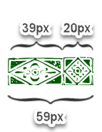
    My goal is to have the line be at least as wide as 1 of the wider segments of our repeating element (39px). With the width increasing from there only by full multiples of 59px.

    That setup will ensure that there will always be a wide element at the far-left of our line, a wide element at the far-right, and one of the narrow 20px elements in the centre.

    We add the extra property in bold:

    	hr.ayh{
    		width: calc(39px + round(down,calc( 100% - 39px),59px));
    		background-image: url( 'four-repeat-both.svg' ); /* our image */
    		background-repeat: repeat-x; /* repeat it horizontally, in the x-dimension */
    		background-position: left top;
    		height: 21px;
    		border: 0;
    	}

    Here is a detailed explanation of what we’re doing:

    And here is the result:


    Approach B: narrow element in the center, double repetition

    Now we will set up the line so that there is always a narrow element in the centre.


    For this approach, we will use the powerful Border-Image property. This property lets us slice an image into 9 pieces, to use 4 of those pieces are the top & bottom edges and the rest as repeating vertical and horizontal elements.


    Read more about the Border-Image property at Smashing Magazine.

    Below is the source image we will slice up for use as a border:

    Here are the important parts of this image:

    1. The far left portion of the border. It does not repeat.
    2. The middle – made up of 2 repetitions of our asymmetrical repeating motif.
    3. The far right portion – also does not repeat.
    4. … there are no other slices. Because we’re creating a horizontal line and not a full surround border, we will slice the image into 3 pieces instead of 9.

    The setup above will always result in the line starting and ending with the wide 39px elements for a symmetrical look.

    Why do we need 2 repetitions for the middle part?

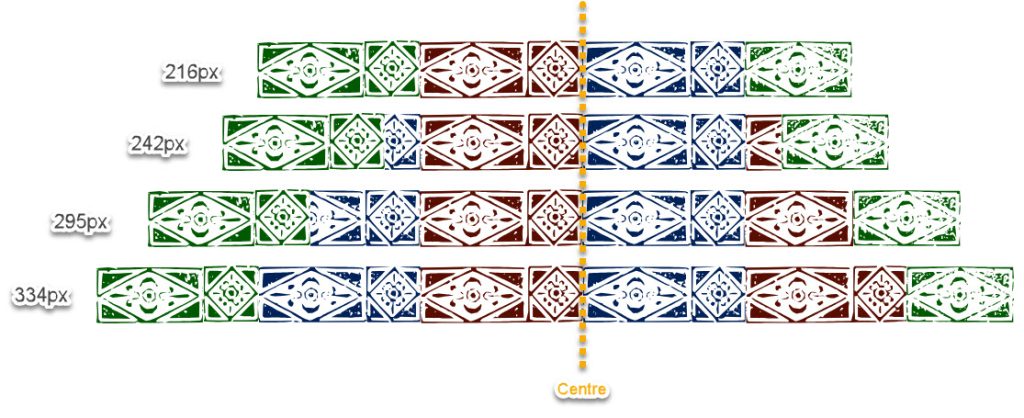
    Border-Image has a counter-intuitive behaviour with the middle repeating portion: as your element gets wider, the middle part of the pattern stays centred. More of the pattern is gradually revealed to the left and to the right of the middle portion as the width grows.

    Let me illustrate.

    The top image shows what happens when the width fits the image above neatly: 59px + 118px + 39px = 216px.

    As the width grows, the red and blue middle portion remains centred, and additional portions are added on both sides.

    Here is the commented CSS code that lets us slice the image and restrict the line width to “neat looking” values:

    hr.bee {
    
    	border-image-source: url( 'multi-size-centered2.svg' );
    	/* the image we will chop into "left side", "right side" and "repeating middle" */
    
    	border-image-slice: 21 39 0 59;
    	/*	from the top: 21px - that's how tall the image is
    		from the right: inset 39px for the "right side" border image
    		from the bottom: 0px - we are not creating a bottom border for this example
    		from the left: chop 59px for the "left side" of the pattern
    	*/
    	
    	border-image-width: 21px 39px 0 59px;
    	/*	the width for our "image border" will have the same dimensions as the slices we took from the original
    		.svg file. We are not stretching or compressing the slices.
    	*/
    
    	box-sizing: content-box;
    	/* our "width" will not include the padding/margin/border in it */
    	
    	padding: 0px 39px 0px 59px;
    	/* add padding on the left and right, to make space for (and match the size of) the left & right portions of the border */
    	
    	border-image-repeat: repeat;
    	/* we will repeat the middle portion of our pattern, without compressing it to fit */
    	
    	width: round(down,calc(100% - 98px),118px);
    	/*
    		We allow the wdth to only have values that prevent pattern cut-off.
    		Because we set box-sizing to "content-box" we are only dealing with the width of the middle repeating portion.
    		So, the width of it will be 100% of the parent, minus the width of the right & left static portions (39px + 59px = 98px).
    		Then, beyond that, we will round to sizes that include 2 full repetitions of our middle portion, which is
    		59px+59px = 118px. We will only reveal widths in increments of 2 full asymmetrical elements
    	*/
    		
    	border-image-outset: 0;
    	/* no outset - our border image will appear where the border would usually appear */
    	
    	height: 21px;
    	/* the height of our border .svg */
    }

    Once again, here is the final result:


    Approach C: wide element in the center, element & 2 halves

    In this method, we will use the border-image attribute while always keeping a wide element at the centre.

    Here is the image that we will slice up for use as border-image:

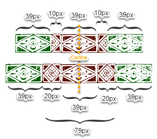
    As we saw above, as the “middle” of your line grows the pattern is repeated on both sides of the centre line. So, in order to turn the image above into a neatly-repeating border, we have to set the width according to this graphic:

    We want the middle (red) portion just wide enough that the narrow elements get fully fleshed out to the sides.

    Here is the commented CSS code that helps us set this up:

    hr.cee {
    
    	border-image-source: url( 'five-border-image.svg?sdfsdf' );
    	/* the image we will chop into "left side", "right side" and "repeating middle" */
    	
    	border-image-slice: 21 39 0 39;
    	/*	from the top: 21px - that's how tall the image is
    		from the right: inset 39px for the "right side" border image - 1 "wide" element
    		from the bottom: 0px - we are not creating a bottom border for this example
    		from the left: chop 39px for the "left side" of the pattern
    	*/
    	
    	border-image-width: 21px 39px 0 39px;
    	/*	the width for our "image border" will have the same dimensions as the slices we took from the original
    		.svg file. We are not stretching or compressing the slices.
    	*/
    	
    	box-sizing: border-box;
    	/* border-box sizing: when we set the "width", it'll encompass padding and borders too */
    	
    	padding: 0px 39px 0px 39px;
    	/* leave space for the "left" and "right" bumper elements */
    	
    	border-image-repeat: repeat;
    	/* we will repeat the middle portion of our pattern, without compressing it to fit */
    	
    	width: calc(79px + 78px + round(down,calc(100% - 78px - 79px),118px));
    	/*
    		The goal is to permit only widths that prevent pattern cutoff.
    		
    		Because box-sizing is "border-box", we have to factor in the width of the padding into our final width.
    		We start with a minimum width of 79px (one whole middle section with the 10+39+10=59 elements PLUS
    		and extra 10+10 to complete the "small" elements in the middle = 59+10+10 = 79.
    		Then we add another minimum +78px which represents the left and right non-repeating bumpers: 39+39.
    		
    		Then, we take the full with of the entire parent = 100%, and subtract this amount from it.
    		Whatever is left over, represents the width of the middle portion's width above what it takes
    		to render the 2 wide bumpers on the sides, 1 wide element in the middle, with 2 small elements on its sides.
    		
    		Next, we take that middle portion and round it down to the smallest multiple of 118px, which is 2
    		full repetitions of the middle portion: 79px + 79px. This repeats the middle portion symmetrically
    		on both sides of the centre line without cutoff.
    	*/
    
    	border-image-outset: 0;
    	/* no outset - our border image will appear where the border would usually appear */
    	
    	height: 21px;
    	/* the height of our border .svg */
    	
    	border-width: 0;
    	/* needed to ensure our width is correct to the pixel */
    }

    And the final result from this code:


  • Victorian-Style Lines for the Web: Elements of Identical Width

    In this tutorial, we will take graphical borders from the 1800s and turn them into a repeating CSS border for your website. The following technique will work for border made of almost-identical repeating elements. We’ll use the free Inkscape illustration software.

    The end result will be this kind of border that neatly fills the parent element, no matter what the parent’s width is. Go ahead and pull at the “resize” tab to make it wider or narrower:


    We will follow these steps:

    • Vectorizing the image of a border
    • Separating each repeating element from its neighbours
    • Rearranging the elements so they can repeat easily using CSS
    • Creating CSS code to ensure we’ll never cut off our border mid-element

    Getting the image

    We’re going to work with the borders at Recueil des divers caractères, vignettes et ornements de la fonderie et imprimerie de J. G. Gillé from 1808 – organically grown and Copyright Free!

    In the above screenshot, the borders that work for our needs are 79, 81, 84, 85, 86 and 88. The others would work if you crop them to drop their central/edge elements which have different widths from the repeating portion.

    Choose a border that is made up of the same width characters repeating.

    I’ve chosen this one for our exercise:

    We zoom in on it and take a screenshot.

    Vectorizing

    We will turn this flat image into a vector (SVG) so that we can easily separate the wreaths and space them out for even repetition.

    Import the image into the Inkscape program (although Adobe Illustrator will also work)

    Go to Path->Trace To Bitmap

    You will end up with a black and white vector like this:

    Separating the elements

    Now, we split this one big path into parts. Go to Path->Split Path and you’ll end up with a bunch of non-overlapping little portions.

    You can see the blue outlines showing distinct paths now:

    But look at the red arrows where some of the wreaths have merged together. This is due to the way the original print was done – where the ink overlapped between separate elements.

    We can split up that merged path by creating a rectangle on top (shown in red), selecting both the rectangle and the path, and then going to Path->Difference to cut the underlying path, then go to Path->Split Path to divide them into 2 separate paths.

    You can also split the shape along thin curve by drawing with the Pen tool (don’t close the curve – just press ENTER to leave a line segment). Then, select the curve and the underlying path and go to Path->Fracture.

    Go on and cut all the shapes away from each other

    Then, go on and select the paths that make up each pattern element (select them, then group them with CTRL+G). When you’re done grouping, you’ll get paths that roughly correspond to individual pattern elements:

    Making each wreath the same width

    Next, we want each element to be the same width so we can predictably repeat the pattern every X pixels.

    Figure out a good average width & height for one of these elements. I do it by selecting one and looking at the Width and Height in px at the top bar. In the example, the repeating element is 22.924px wide by 21.815px high.

    Let’s go ahead and make each element 22px wide. Select one object and change its width manually to 22px while keeping the height “locked” to the same aspect ratio with the lock icon.

    Select your one object and copy it. Then, select all the other objects:

    Go to Edit->Paste->Size Separately. This will give all of them the same height & width as the “reference object” you just copied. This is just a fast way to force all of them to have the same width – there are probably other ways to do the same thing.

    Then we go to Object->Align and Distribute->Grid

    The settings in the screenshot will distribute them horizontally with no spaces in between. If your pattern is the kind that looks good with spaces between the elements, then you can enter 1 or 2 px in that “X:” field.

    We apply the grid and get elements of the same width and height, touching:

    You can adjust height, and vertical offset to break up the pattern a little if you want:

    I realize this is way more effort than using 1 wreath and repeating the same image as many times as we need. The goal of using the scanned wreaths and adjusting them is to create an “organic” look that imitates imperfect printing.

    Give them whatever fill-colour you want and export as “Plain SVG”

    Creating CSS that never cuts off mid-element

    Next, we are going to set up the SVG pattern as a repeating background on an <hr> element. If we simply let the pattern repeat across 100% of the element’s width it’ll often cut off mid-element:

    The key part of our CSS: only letting <hr> have a width value that’s a multiple of 22px (the width of each repeating element). The width will never be set to a value that cuts off an element.

    We can do this with the CSS round() function:

    width: round(down,100%,22px);

    Above, we are setting the width of the element to 100% of its parent, but rounding it down to the closest multiple of 22px.

    Here is what the full code looks like, with the “background-image” declaration, horizontal repetition and width:

    hr {
    		width: round(down,100%,22px);
    		background-image: url( 'exported-image.svg' );
    		background-repeat: repeat-x;
    		height: 25px;
    		border: 0;
    	}

    Note: if the <hr> element has a max-width declared upstream, it might still create cutoff problems. Max-width always takes precedence over the rounded width we set here, and cuts off the repeating border regardless.

    You’ll get cut-off effects like this:

    One solution is to surround your <hr> element in a <div> – that way it is the div element that’ll get clamped down to the max-width and will leave the hr to be rounded properly. Another solution is to add an !important max-width onto the <hr> definition, like max-width: round( down, "max-width of the parent", 22px)

    You can scale up the repeating elements by setting background-size: auto 55px; (height = 55px, width = scale up proportionally), but you’ll have to also set height: 55px, and set the width to round() down to an appropriately-scaled up pixel width.

  • October Links

    Enjoy some random links from October. Slow down. Breathe in. Feel your productivity die.


    Fragmentarium – a database of illuminated manuscript fragments for the fragment-hounds among us!

    Bonus marks challenge: use AI to put together fragments that look like they belong together back into a single manuscript. (Remember, people cut up and sell books piecemeal. There’s even one such wonderful gentleman running a store on my street.)

    The helmet of my dreams:
    https://paolopuck.com/

    I like Paolo Puck’s alternative universe of ephemera and artefacts. I especially like this poster of ice cream treats. I’d eat a “French Kiss”:

    Museum of novelty coin-operated machines. Has a lot of machines that touch, spray and dribble on you. For money!

    BYTE Magazine

    There is a new cool visual archive of all BYTE magazine issues from the UK. Here are a couple of neat ads from the magazine:

    Hej Mansplunk! Qume test drive our hot new daisywheelers. Joo hast many sprinkens that are redy zoo jump into action and squelk jorn business zu the topp! Sounds like an AI hallucination
    https://byte.tsundoku.io/#198407-181

    Terrible clip-art style

    Here are some examples of a particular visual style that I hate, from the magazine. It’s like early 2000s clipart.

    I don’t know what it’s called, and I couldn’t find it at the wonderful Consumer Aesthetics Research Institute (CARI). Maybe I’ll submit it as a new style?

    Category listing page from CARI

    Tiny cameras, tiny pictures

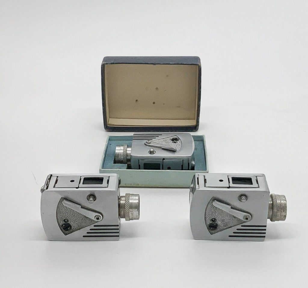
    I went to a miniature-makers show and sale. There, I purchased a tiny photo – made by a tiny camera. Huh… I guess those were a thing:

    Here is more information about the tiny round Petal camera. It came with a round “film punch” and you’d punch out round holes out of your normal film – all in a pitch-black room.

    Airbrushed T-Shirts: Shirt Kings

    Do you remember airbrushed custom T-Shirts? Read the story of Shirt Kings out in Queens. There’s also a nice podcast interview with Phade.

    More pictures on Phade’s website.

    Iron-On T-Shirts: Roach Studios

    Do you remember Iron-On T-Shirts at the mall? This grandpa remembers!

    Roach Studios looks like a big player, but quite a lot of their shirts were tasteless
    Here’s a short history of Roach Studios.

    More – https://2warpstoneptune.com/category/iron-on-transfers/roach-studios/

    From the 1974 Roach Catalog


    Not quite sure how to process this synopsis of an animated film called “American Pop”

    source


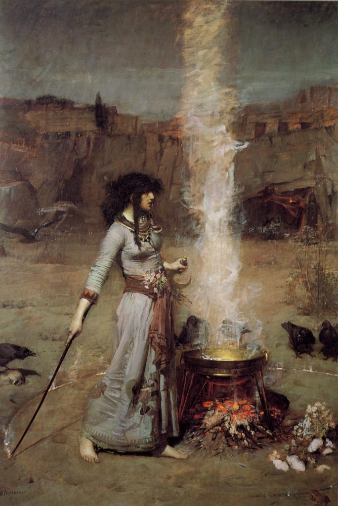
    I’m liking this picture – probably because I’m really enjoying Naomi Novik’s Scholomance books right now. I remembered looking into the painter, John William Waterhouse, years ago. He drew pretty striking Pre-Raphaelite women, and I figured his wife was his model. Dear Reader – his wife looked nothing like the women he constantly drew. Yikes for both of them.

    The Magic Circle, John William Waterhouse

    Fun fact: this Waterhouse model ended up becoming a Ukrainian musician, making Rennaisance Dubstep bangers that are just… perfection.


    Elliott Dold’s Night : scans cleaned up by John Coulthart. John says that the poetry itself falls far short of the illustrations – he’s right.

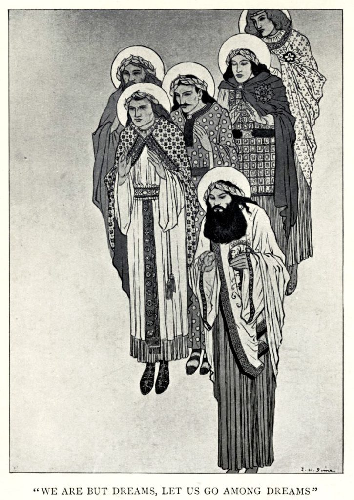
    S. H. Sime – Sidney Sime

    A short biography of S. H. Sime by Jim Vadeboncoeur Jr
    He mostly illustrated for the writer Lord Dunsany.

    Jim’s site was a wonderful resource for illustrator biographies, and you can still read them at the Web Archive.

    Here are the illustrator biographies on the site:

    E.A. Abbey
    Harvey Dunn
    Heinrich Kley
    W. Heath Robinson
    Charles Addams
    Walter H. Everett
    Roy Krenkel
    Harry Rountree
    Harry Anderson
    Nicolai Fechin
    Bernard Krigstein
    Mead Schaeffer
    Boris Artzybasheff
    Virgil Finlay
    Harvey Kurtzman
    John Schoenherr
    John Austen
    Jas. Montgomery Flagg
    Dorothy Lathrop
    Frank Schoonover
    Carl Barks
    W. Russell Flint
    Robert Lawson
    Ronald Searle
    George Barr
    Hal Foster
    Alan Lee
    Jose Segrelles
    John Bauer
    Frank Frazetta
    J.C./F.X. Leyendecker
    Sidney Sime
    Ivan Bilibin
    Frank Kelly Freas
    Norman Lindsay
    Jessie Willcox Smith
    Mahlon Blaine
    Warwick Goble
    Andrew Loomis
    J. Allen St. John
    Franklin Booth
    Frank Godwin
    Orson Lowell
    E.J. Sullivan
    Frank Brangwyn
    Walter Dean Goldbeck
    Winsor McCay
    Gustaf Tenggren
    Zdenek Burian
    Gordon Grant
    Moebius
    Alex Toth
    George Carlson
    Elizabeth Shippen Green
    Alphonse Mucha
    Alberto Vargas
    André Castaigne
    Milt Gross
    Kay Nielsen
    Various I
    H.C. Christy
    John Held, Jr.
    Mel Odom
    Various II
    Walter Appleton Clark
    Al Hirschfeld
    Eric Pape
    John Vassos
    Harry Clarke
    Burne Hogarth
    Frank Papé
    Daniel Vierge
    Joseph Clement Coll
    Brad Holland
    Maxfield Parrish
    Harold Von Schmidt
    Dean Cornwell
    (Robert E. Howard)
    Virgil Partch
    Lynd Ward
    Frank Craig
    Albert Hurter
    George Petty
    Basil Wolverton
    Will Crawford
    Jeffrey Jones
    C. Coles Phillips
    Lawson Wood
    Percy Crosby
    Michael Wm. Kaluta
    Willy Pogany I
    Wally Wood
    E.J. Detmold
    Arthur I. Keller
    Willy Pogany II
    Sulamith Wülfing
    Leo & Diane Dillon
    Walt Kelly
    Howard Pyle
    N.C. Wyeth
    Katherine Sturges Dodge
    Everett Raymond Kinstler
    Arthur Rackham
    Edmund Dulac
    Jack Kirby
    Charles Robinson

  • Brett & Beaver

    Brett & Beaver was a Canadian animated television series created by Stockwell McNight. The series was first broadcast in 1978 on CBC1 and became enormously popular in Manitoba, Labrador and Eastern British Columbia over its 7-year run. The music for the show was created by Film Boards of Canada and made use of cutting-edge synthesizer technology.

    Notably, the show prefigured several real-world events in Canadian history years before their actual occurrence.

    This page is my partial archive of episodes, inspired by Jordan Minor’s pioneering work with the Street Sharks cartoon. Many people outside Canada are unaware of cultural sensations such as Rocky and Bullwinkle (Canadian Looney Tunes), Captain Canuck (Canadian Superman), Honeymoon Suite (Canadian Flock of Seagulls), Candi (Canadian Madonna) and Moses Znaimer (Canadian Marshall McLuhan) – this page is my attempt at bringing more Canadian culture to the world.

    No. OverallTitleWritten ByFirst Air DateProd. Code
    07“Resource Curse”1Stockwell McNight
    Barb O’Shea (?)
    October 14, 1979Q77888
    Synopsis
    Brett and Beaver are working at the lumber mill, when a sudden bumper harvest of trees has Boss Goldsworthy turn them into Entrepreneurs in Residence. “Find out what we can do with all these extra trees!” the Boss exclaims.

    Brett and Beaver start with an idea for producing wooden bowls and plates on a small scale. Soon, they begin coming up with novel ideas for other businesses: producing skateboards, terracotta pots, selling telephones, personal computers (PCs) and even dabbling in the emerging technology of “3D Printing”. The businesses aren’t profitable right away and the Boss refuses to fund every one of them. “None of these newfangled ideas of yours are as profitable as our established business. If a new business is not immediately as profitable as our old lumber business, then I won’t waste time on it!”.

    At the end of the episode, an American lumber baron purchases the mill. The mill continues to produce raw lumber. We see how the lumber is transported to the USA, transformed into useful finished products, and sold back to Canadians at a 200% markup. The American owners are very satisfied, while Brett and Beaver resume their old positions at the lumber mill.
    No. OverallTitleWritten ByFirst Air DateProd. Code
    08“National Champion”Stockwell McNightNovember 6, 197967G4GC
    Synopsis
    While out building a dam, Beaver hears loud yelling. The yelling comes from his company’s lumberjacks trying to talk over large distances. Spotting a business opportunity, Brett and Beaver decide to start a business selling walkie-talkies and communication services to lumberjacks. They call it North-Yell Networks.

    North-Yell grows until they are the main telecommunications provider for lumberjacks in Northern British Columbia. At that point, Madagascar’s national telecommunication provider Hwy Wait Networks tries to muscle in on their market. The advance is led by businessman Bakoly Baovola and his rare Madagascan panda Veronica.

    Hwy Wait Networks are connected to the King of Madagascar and have the country’s spy network at their disposal. The spies tracks, photograph and eavesdrop on Brett and Beaver. After a walkie-talkie wiretapping incident, Brett complains to Sheriff Shirley who dismisses him and says “There are no foreign spies on Canadian soil! How preposterous! We are the most beloved country in the world!”.

    North-Yell begins losing customers to Hwy Wait. A major deal with the Alberta Alder-Fellers Brotherhood has the potential to save Brett and Beaver’s business. When it comes time to negotiate, Hwy Wait wins the bid by providing the service at far below its true cost. North-Yell loses the critical deal and goes bankrupt.

    Over beers with Sheriff Shirley, the Sheriff exclaims “It’s eerie, boys. Almost like they knew every move you were planning to make, eh?!” Beaver delivers a monologue, asking “How can Canadian entrepreneurs compete against foreign government-backed businesses when – even on Canadian soil – their own government permits this unfair advantage?”. None of the other patrons in the bar hear his monologue.2

    Brett and Beaver return to their jobs at the lumber mill.
    No. OverallTitleWritten ByFirst Air DateProd. Code
    14“Gander”Ryan “Gosling” Swanson
    Barb O’shea
    September 3, 198077L43L
    Synopsis
    After discovering that he is 1/64th Black, Brett refashions himself as soft-rapper Gander. His apology-rock3 tune Beg Your Pardon catapults him to sudden fame. Brett and Beaver move to Miami, where they follow up with Canadian love ballad May We Possibly Be Friends, gangsta-rap tune Castoreum In Yo Ice-Cream and Christmas rap Under The Beavertail.

    Brett’s ego gets too big as he re-christens the city of Nanaimo as “The N9ine”, against the residents’ wishes. When Brett starts a “beef” with talented rapper Dandruff LaBeuff, it is revealed that Brett may have fathered a secret daughter. Public opinion turns against Brett as he is accused of Transporting an Endangered Rodent Across State Lines and illegally keeping a pet beaver.

    Destitute, Brett & Beaver beat a hasty retreat to Canada. The episode ends with them returning to their former jobs at the lumber mill.
    No. OverallTitleWritten ByFirst Air DateProd. Code
    23“Cultural Legos”Ernie Falwell
    Stephen Brophen
    January 20, 19832P7B37
    Synopsis
    A natural disaster in Nunavut brings a wave of Inuit refugees to Brett and Beaver’s town. Beaver decides to make the newcomers welcome by starting a culinary exchange. Brett and Beaver become obsessed with Inuit delicacies such as beluga blubber, seal meat and bison burgers.

    Mayor Marigold decides to double down on culinary exchanges, picnics and food-festivals. After 6 months of gorging himself, Brett realizes that he knows practically nothing about the culture, language and history of his new neighbour – only their food. They live in a separate part of town and there are no opportunities for talking with them. Brett is alarmed to discover that many of the newcomers do not speak English and aren’t aware of the same town facilities and services that longtime residents benefit from.

    Brett and Beaver deliver an impassioned plea to Town Council, saying that the townspeople are missing an opportunity to learn from the rich perspective and deep culture of the Inuit arrivals; while the Inuit are missing out on the benefits of integrating into their new hometown.

    Mayor Marigold dismisses Brett’s arguments, explaining that “We live according to a concept called Cultural Legos4 where each colour is separated and stays in it’s own bin. What a mess it would be if we mixed all these Legos together in one big bin!”. Brett and beaver return to their job at the lumber mill.
    No. OverallTitleWritten ByFirst Air DateProd. Code
    24“Mein Camp”Ernie Falwell
    Stephen Brophen
    February 23, 19832924JP
    Synopsis
    Troubled by the arrival of newcomers from the North, a group of townsmen set up a special tent camp with no “outsiders” allowed. Brett is troubled by their hate and vows to take them down. The camp leader falls madly in love and runs away with beautiful Valkyrie Mitford (from Swastika, Ontario) – and that is just the opening that Brett was waiting for.

    Brett approaches Sheriff Shirley and officially goes undercover at the camp. Vowing to take them down, Brett swiftly rises through the ranks by being quick to violence and by recruiting many members to the cause. Sheriff Shirley provides cash and supplies to the group “so that their future takedown is even more crushing”. Beaver is disturbed and warns Brett: “We are what we pretend to be, so we must be careful about what we pretend to be.” Brett becomes leader of the hate camp.

    After an Inuit house is spraypainted, local journalist November O’Brien discovers that this group of xenophobes is led by an undercover police agent5. Brett is ashamed of how far astray he had gone. Brett faces no consequences after Mayor Marigold gives beseeches the townspeople to forget about the whole sordid affair: “After all, there is no racism in Canada – racism is something that only happens elsewhere 6“.

    Chastened, Brett and Beaver return to their old jobs at the lumber mill.

    1. Resource Curse is an economic phenomenon where a country that is rich in a natural resource focuses on extracting that resource, and neglects other parts of it’s economy. Like what happens in a “Petro-State”.
      This episode also foresaw the takeover of Canada’s resource industries by foreign owners, sometimes in tragicomic ways. ↩︎
    2. This episode bears an uncanny resemblance to the real-world downfall of Nortell Networks. Series creator Stockwell McNight was rumoured to be a participant of Canada’s Remote Viewing program. For the rest of his life, Stockwell would have attacks he described as “becoming unmoored in time and space”. McNight would come out of these episodes with notes he used to inform his stock picking decisions. In later life, when he left the TV business, McNight was to become one of Canada’s wealthiest investors. ↩︎
    3. The genre of “Apology Rock” is mainstream in Canada. Examples include “Sorry” by Justin Bieber, “Beg Your Pardon” by Kon Kan and “Sorry Not Sorry” by Bryson Tiller. This sound is closely related to the Polite Canadian Breakup genre exemplified by the track “New Girl Now” by Honeymoon Suite – and their classic lyric, “I got a new girl now. And she’s a lot like you!”. ↩︎
    4. Likely a reference to the “Cultural Mosaic“. I’ll tell you, living in the Greater Toronto Area – it is very easy to try cuisines from all over the world, but nobody is helping people go beyond that and truly understand the different cultures in the city. ↩︎
    5. Strikingly, this episode prefigured the 1994 “Operation Governor” fiasco, where Canadian intelligence service CSIS funded the creation and operation of a racist hate group, Heritage Front. Grant Bristow, Chief Security officer of Heritage Front, was a CSIS mole and faced no consequences for being exceptionally effective as a racist, and lacking as an agent. ↩︎
    6. This is almost certainly sarcasm on the part of the writers. Canada has a rich history of racism that is unacknowledged in Canadian society. It begins with the well known and long-lived residential schools, meant to ethnically cleanse the native population (the last of these closed in 1997). From 1885 to 1948, Canada had a special “Chinese Head Tax” to ensure that Chinese people did not settle in the country. In 1939, Canada was one of the countries that explicitly refused entry to a ship full of refugees fleeing the Nazis. The incident coined the phrase “None is too many” when it came to Jewish immigration into Canada. After WWII, Canada rolled out a welcome mat for Nazi collaborators who wanted to escape justice – specifically the Ukrainian Nationalist death squads. Nowadays, numerous memorials to special units of the SS exist throughout Canada, and former members of Waffen SS make surprise appearances in Parliament even in 2023. Nazi collaborators also pop up, inconveniently, in the family trees of key Canadian government ministers. In 2016, Canadian Gavin McInnes founded the Proud Boys. In recent years, Canada has set up a gauntlet of scams to drain cash from foreign students. Most of the impacted students are from a single ethnicity – but, hold-on this isn’t racism – after all, they willingly chose to get fleeced! Instead of introspection, Canadians choose to “grin harder” and pursue a “rename and ignore” policy to ensure that no lessons are learned. ↩︎