Category: how to

  • Removing dust from 2 scans of the same page with Photo Stacking

    I recently went to scan an old newspaper ad on microfilm – and the scanner was covered in dust.

    There is a way to “cancel out” the look of dust. So I took a second scan of each page, slightly offset from the first. If we align the two scans perfectly then you can see how the text “stays” while the dust “moves” between images:

    We can remove the dust using a technique called “Photo Stacking” where we use the differences between the two images to create a third “corrected” image.

    Setting up

    First, go to https://www.photopea.com/ in order to get set up.

    1. Click File -> Open to load your first image
    2. Then, click File -> Open & Place to add the second image as a layer
    3. Select both layers and align them to each other by clicking Edit -> Auto Align
    4. With both layers still selected, click Layer -> Smart Object -> Convert to Smart Object . Both layers will be combined into one.
    5. Perform the stacking: click Layer -> Smart Object -> Stack Mode and select one of the modes below.

    Stacking modes

    Maximum

    Maximum channel values are retained. The brightest values for a pixel “win out” across the 2 photos – so all the dark blemishes disappear.

    This is convenient in our case because we only have dark blemishes.

    When the same pixel has “black dust” in one pic and “white background” in the other pic, the white background wins out because it is brighter. Pixels that have “black letter” colour will have the same colour across the 2 pics and will be unaffected.

    (If we had white blemishes in the microfilm scan, then Maximum stacking mode would retain those ones!)

    Minimum

    The minimum (darkest) channel values are always retained.

    In our case, the dark blemishes are accentuated. We put them in the final image whenever they appear in image 1 OR in image 2.

    This stacking order would be great for eliminating white blemishes.

    Average / Median

    In these modes, we use either the Average or the Median value for a pixel in a stack.

    They are good for reducing noise, whatever the colour/brightness may be. But I think they won’t remove it completely.

    In our example, because we have just 2 images – the average and the median stack mode are the same.

    If you had many images in your stack, then the difference between the two modes would matter:

    Average would soften the image. It would perform a calculation, and set each pixel to the average value across the image stack.

    Median would keep images sharper – it would pick a specific “middle most common” value that appears for a pixel across the entire stack. It won’t calculate a softer value. See the slider at the bottom of this post for a comparison.

    Modes that help analyze your images

    Range

    The value of a pixel would be the difference between the Maximum brightness seen and the Minimum brightness seen.

    In our example, this ends up highlighting those areas where a portion of the white paper background had a dark blemish on it – across the 2 images.

    The reason why you don’t see the black letters, is because they remained the same across the two images. If we had white blemishes appearing on top of them, then the would show up in Range mode.

    Standard Deviation

    Analytical: measures the distribution of information between the images. Useful for object removal as it clearly indicates areas that will be averaged out with a Median stack mode.

    Variance

    Analytical: as Standard Deviation, indicates how pixel values are spread between images. More intense distributions are shown very clearly.

    Summation

    Produces the total value of pixels from each image. Usually results in overexposure, but can be used to lighten very underexposed imagery.

    If you are photographing an object at night, with a bad camera, you could correct those photos with the Summation mode.

    Additional resources

    • You can Stack images in Photoshop using the exact same steps. Except, in some versions of Photoshop (CS6 for me) the “Stack Mode” menu option is always greyed out. It seems like the functionality just isn’t there for older versions.
    • There is a Photoshop stacking tutorial that works even on older versions, but appears to only perform the Minimum stacking mode. It will accomplish Focus Stacking but won’t help you remove dust from an image.
    • Tutorial on “Focus Stacking” in Photopea. This technique lets you combine 2 half-blurry images to create 1 sharp image.
  • Making a Victorian CSS Border: Dual-Motif

    In the previous tutorial, we learned how to make an 1800s-style CSS border with a single-motif repeating element:


    Now, you will learn 3 ways to create horizontal lines with repeating Victorian motifs, where the repeating elements are not identical. See the example below, be sure to drag the “resize handle” to see how these lines adapt to different widths:

    Method A:

    Method B:

    Method C:

    Like in the previous post, we will be using the free Inkscape for vector editing.

    Table of contents:

    • Get the images and vectorize them
    • Approach A: simple repetition. Alternating wide/narrow in the centre.
    • Approach B: double repetition. Always a narrow element in the centre.
    • Approach C: one-and-two-halves repetition. Always a wide element in the centre.

    Get the image

    We’ll be working with the Recueil des divers caractères, vignettes et ornements de la fonderie et imprimerie de J. G. Gillé from 1808.

    Let’s choose an asymmetrical (or, dual-motif) pattern. In the below screenshot, the central motifs in specimens 98, 100 and 101 are suitable.

    We will use number 100 for this tutorial:

    First, we turn it into a vector (SVG) and group the wide elements and narrow elements separately.

    Approach A: simple repetition

    The following method is the simplest way to fill in a horizontal line. We will use the background-image property with a horizontal repetition.

    The line will be symmetrical, but sometimes the central element will be “wide” and sometimes “narrow”. This is a weakness – if you ever want to put a special one-of-a-kind element in the middle of the line, you wouldn’t know whether to make it wide or narrow.

    Initially, we will repeat this image horizontally:

    Here is the CSS for a basic repetition:

    	hr.ayh{
    		background-image: url( 'four-repeat-both.svg' ); /* our image */
    		background-repeat: repeat-x; /* repeat it horizontally, in the x-dimension */
    		background-position: left top;
    		height: 21px;
    		border: 0;
    	}

    This approach often cuts off the pattern, depending on the width of the element:

    Our goal is to restrict the width of this element to a value that prevents cutoff and where the pattern is symmetrical. We want the width of our element to “land in between” the patterns.

    To do that we will use the CSS functions calc(), which performs basic math functions, and round() which lets us round-down to the nearest multiple of a value.

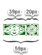
    My goal is to have the line be at least as wide as 1 of the wider segments of our repeating element (39px). With the width increasing from there only by full multiples of 59px.

    That setup will ensure that there will always be a wide element at the far-left of our line, a wide element at the far-right, and one of the narrow 20px elements in the centre.

    We add the extra property in bold:

    	hr.ayh{
    		width: calc(39px + round(down,calc( 100% - 39px),59px));
    		background-image: url( 'four-repeat-both.svg' ); /* our image */
    		background-repeat: repeat-x; /* repeat it horizontally, in the x-dimension */
    		background-position: left top;
    		height: 21px;
    		border: 0;
    	}

    Here is a detailed explanation of what we’re doing:

    And here is the result:


    Approach B: narrow element in the center, double repetition

    Now we will set up the line so that there is always a narrow element in the centre.


    For this approach, we will use the powerful Border-Image property. This property lets us slice an image into 9 pieces, to use 4 of those pieces are the top & bottom edges and the rest as repeating vertical and horizontal elements.


    Read more about the Border-Image property at Smashing Magazine.

    Below is the source image we will slice up for use as a border:

    Here are the important parts of this image:

    1. The far left portion of the border. It does not repeat.
    2. The middle – made up of 2 repetitions of our asymmetrical repeating motif.
    3. The far right portion – also does not repeat.
    4. … there are no other slices. Because we’re creating a horizontal line and not a full surround border, we will slice the image into 3 pieces instead of 9.

    The setup above will always result in the line starting and ending with the wide 39px elements for a symmetrical look.

    Why do we need 2 repetitions for the middle part?

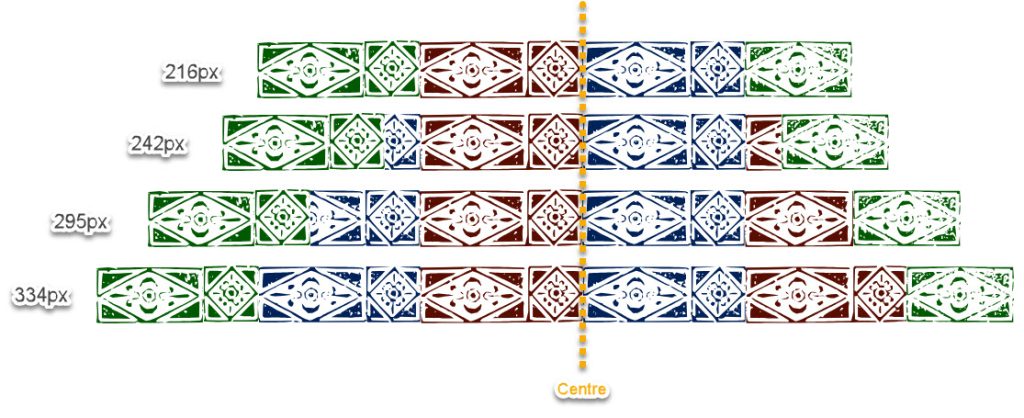
    Border-Image has a counter-intuitive behaviour with the middle repeating portion: as your element gets wider, the middle part of the pattern stays centred. More of the pattern is gradually revealed to the left and to the right of the middle portion as the width grows.

    Let me illustrate.

    The top image shows what happens when the width fits the image above neatly: 59px + 118px + 39px = 216px.

    As the width grows, the red and blue middle portion remains centred, and additional portions are added on both sides.

    Here is the commented CSS code that lets us slice the image and restrict the line width to “neat looking” values:

    hr.bee {
    
    	border-image-source: url( 'multi-size-centered2.svg' );
    	/* the image we will chop into "left side", "right side" and "repeating middle" */
    
    	border-image-slice: 21 39 0 59;
    	/*	from the top: 21px - that's how tall the image is
    		from the right: inset 39px for the "right side" border image
    		from the bottom: 0px - we are not creating a bottom border for this example
    		from the left: chop 59px for the "left side" of the pattern
    	*/
    	
    	border-image-width: 21px 39px 0 59px;
    	/*	the width for our "image border" will have the same dimensions as the slices we took from the original
    		.svg file. We are not stretching or compressing the slices.
    	*/
    
    	box-sizing: content-box;
    	/* our "width" will not include the padding/margin/border in it */
    	
    	padding: 0px 39px 0px 59px;
    	/* add padding on the left and right, to make space for (and match the size of) the left & right portions of the border */
    	
    	border-image-repeat: repeat;
    	/* we will repeat the middle portion of our pattern, without compressing it to fit */
    	
    	width: round(down,calc(100% - 98px),118px);
    	/*
    		We allow the wdth to only have values that prevent pattern cut-off.
    		Because we set box-sizing to "content-box" we are only dealing with the width of the middle repeating portion.
    		So, the width of it will be 100% of the parent, minus the width of the right & left static portions (39px + 59px = 98px).
    		Then, beyond that, we will round to sizes that include 2 full repetitions of our middle portion, which is
    		59px+59px = 118px. We will only reveal widths in increments of 2 full asymmetrical elements
    	*/
    		
    	border-image-outset: 0;
    	/* no outset - our border image will appear where the border would usually appear */
    	
    	height: 21px;
    	/* the height of our border .svg */
    }

    Once again, here is the final result:


    Approach C: wide element in the center, element & 2 halves

    In this method, we will use the border-image attribute while always keeping a wide element at the centre.

    Here is the image that we will slice up for use as border-image:

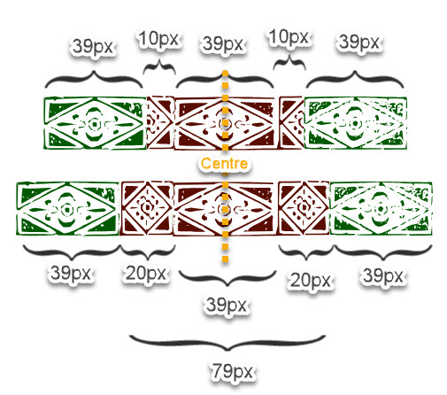
    As we saw above, as the “middle” of your line grows the pattern is repeated on both sides of the centre line. So, in order to turn the image above into a neatly-repeating border, we have to set the width according to this graphic:

    We want the middle (red) portion just wide enough that the narrow elements get fully fleshed out to the sides.

    Here is the commented CSS code that helps us set this up:

    hr.cee {
    
    	border-image-source: url( 'five-border-image.svg?sdfsdf' );
    	/* the image we will chop into "left side", "right side" and "repeating middle" */
    	
    	border-image-slice: 21 39 0 39;
    	/*	from the top: 21px - that's how tall the image is
    		from the right: inset 39px for the "right side" border image - 1 "wide" element
    		from the bottom: 0px - we are not creating a bottom border for this example
    		from the left: chop 39px for the "left side" of the pattern
    	*/
    	
    	border-image-width: 21px 39px 0 39px;
    	/*	the width for our "image border" will have the same dimensions as the slices we took from the original
    		.svg file. We are not stretching or compressing the slices.
    	*/
    	
    	box-sizing: border-box;
    	/* border-box sizing: when we set the "width", it'll encompass padding and borders too */
    	
    	padding: 0px 39px 0px 39px;
    	/* leave space for the "left" and "right" bumper elements */
    	
    	border-image-repeat: repeat;
    	/* we will repeat the middle portion of our pattern, without compressing it to fit */
    	
    	width: calc(79px + 78px + round(down,calc(100% - 78px - 79px),118px));
    	/*
    		The goal is to permit only widths that prevent pattern cutoff.
    		
    		Because box-sizing is "border-box", we have to factor in the width of the padding into our final width.
    		We start with a minimum width of 79px (one whole middle section with the 10+39+10=59 elements PLUS
    		and extra 10+10 to complete the "small" elements in the middle = 59+10+10 = 79.
    		Then we add another minimum +78px which represents the left and right non-repeating bumpers: 39+39.
    		
    		Then, we take the full with of the entire parent = 100%, and subtract this amount from it.
    		Whatever is left over, represents the width of the middle portion's width above what it takes
    		to render the 2 wide bumpers on the sides, 1 wide element in the middle, with 2 small elements on its sides.
    		
    		Next, we take that middle portion and round it down to the smallest multiple of 118px, which is 2
    		full repetitions of the middle portion: 79px + 79px. This repeats the middle portion symmetrically
    		on both sides of the centre line without cutoff.
    	*/
    
    	border-image-outset: 0;
    	/* no outset - our border image will appear where the border would usually appear */
    	
    	height: 21px;
    	/* the height of our border .svg */
    	
    	border-width: 0;
    	/* needed to ensure our width is correct to the pixel */
    }

    And the final result from this code:


  • Victorian-Style Lines for the Web: Elements of Identical Width

    In this tutorial, we will take graphical borders from the 1800s and turn them into a repeating CSS border for your website. The following technique will work for border made of almost-identical repeating elements. We’ll use the free Inkscape illustration software.

    The end result will be this kind of border that neatly fills the parent element, no matter what the parent’s width is. Go ahead and pull at the “resize” tab to make it wider or narrower:


    We will follow these steps:

    • Vectorizing the image of a border
    • Separating each repeating element from its neighbours
    • Rearranging the elements so they can repeat easily using CSS
    • Creating CSS code to ensure we’ll never cut off our border mid-element

    Getting the image

    We’re going to work with the borders at Recueil des divers caractères, vignettes et ornements de la fonderie et imprimerie de J. G. Gillé from 1808 – organically grown and Copyright Free!

    In the above screenshot, the borders that work for our needs are 79, 81, 84, 85, 86 and 88. The others would work if you crop them to drop their central/edge elements which have different widths from the repeating portion.

    Choose a border that is made up of the same width characters repeating.

    I’ve chosen this one for our exercise:

    We zoom in on it and take a screenshot.

    Vectorizing

    We will turn this flat image into a vector (SVG) so that we can easily separate the wreaths and space them out for even repetition.

    Import the image into the Inkscape program (although Adobe Illustrator will also work)

    Go to Path->Trace To Bitmap

    You will end up with a black and white vector like this:

    Separating the elements

    Now, we split this one big path into parts. Go to Path->Split Path and you’ll end up with a bunch of non-overlapping little portions.

    You can see the blue outlines showing distinct paths now:

    But look at the red arrows where some of the wreaths have merged together. This is due to the way the original print was done – where the ink overlapped between separate elements.

    We can split up that merged path by creating a rectangle on top (shown in red), selecting both the rectangle and the path, and then going to Path->Difference to cut the underlying path, then go to Path->Split Path to divide them into 2 separate paths.

    You can also split the shape along thin curve by drawing with the Pen tool (don’t close the curve – just press ENTER to leave a line segment). Then, select the curve and the underlying path and go to Path->Fracture.

    Go on and cut all the shapes away from each other

    Then, go on and select the paths that make up each pattern element (select them, then group them with CTRL+G). When you’re done grouping, you’ll get paths that roughly correspond to individual pattern elements:

    Making each wreath the same width

    Next, we want each element to be the same width so we can predictably repeat the pattern every X pixels.

    Figure out a good average width & height for one of these elements. I do it by selecting one and looking at the Width and Height in px at the top bar. In the example, the repeating element is 22.924px wide by 21.815px high.

    Let’s go ahead and make each element 22px wide. Select one object and change its width manually to 22px while keeping the height “locked” to the same aspect ratio with the lock icon.

    Select your one object and copy it. Then, select all the other objects:

    Go to Edit->Paste->Size Separately. This will give all of them the same height & width as the “reference object” you just copied. This is just a fast way to force all of them to have the same width – there are probably other ways to do the same thing.

    Then we go to Object->Align and Distribute->Grid

    The settings in the screenshot will distribute them horizontally with no spaces in between. If your pattern is the kind that looks good with spaces between the elements, then you can enter 1 or 2 px in that “X:” field.

    We apply the grid and get elements of the same width and height, touching:

    You can adjust height, and vertical offset to break up the pattern a little if you want:

    I realize this is way more effort than using 1 wreath and repeating the same image as many times as we need. The goal of using the scanned wreaths and adjusting them is to create an “organic” look that imitates imperfect printing.

    Give them whatever fill-colour you want and export as “Plain SVG”

    Creating CSS that never cuts off mid-element

    Next, we are going to set up the SVG pattern as a repeating background on an <hr> element. If we simply let the pattern repeat across 100% of the element’s width it’ll often cut off mid-element:

    The key part of our CSS: only letting <hr> have a width value that’s a multiple of 22px (the width of each repeating element). The width will never be set to a value that cuts off an element.

    We can do this with the CSS round() function:

    width: round(down,100%,22px);

    Above, we are setting the width of the element to 100% of its parent, but rounding it down to the closest multiple of 22px.

    Here is what the full code looks like, with the “background-image” declaration, horizontal repetition and width:

    hr {
    		width: round(down,100%,22px);
    		background-image: url( 'exported-image.svg' );
    		background-repeat: repeat-x;
    		height: 25px;
    		border: 0;
    	}

    Note: if the <hr> element has a max-width declared upstream, it might still create cutoff problems. Max-width always takes precedence over the rounded width we set here, and cuts off the repeating border regardless.

    You’ll get cut-off effects like this:

    One solution is to surround your <hr> element in a <div> – that way it is the div element that’ll get clamped down to the max-width and will leave the hr to be rounded properly. Another solution is to add an !important max-width onto the <hr> definition, like max-width: round( down, "max-width of the parent", 22px)

    You can scale up the repeating elements by setting background-size: auto 55px; (height = 55px, width = scale up proportionally), but you’ll have to also set height: 55px, and set the width to round() down to an appropriately-scaled up pixel width.