Do you remember “Toronto Unlimited”?
I do!
It was the summer of 2005 and the Tourism Toronto agency had just launched a new “city brand” campaign with a new logo, tagline and ad campaign for the City of Toronto.
The campaign was bland and instantly forgettable. The big bold vision of a city of insurance adjusters:


The new initiative cost $4 million and was jointly created by TBWA Toronto and Brand Architecture International, based in New York. (Both part of Omnicom).
Toronto Unlimited launched with their own website. Here’s a quote:
For many years Toronto has been a best kept secret tourist destination; a result of its people’s modest character. But the media and demanding travelers have discovered this cultural Mecca and are beginning to spread the word.
And a sleepyfing TV ad:
“A city that is forever unfolding” indeed
The big international reveal came on June 26, 2005 with a 2-page ad in the New York Times. The ad had typos (“For seventeen years the Beaches International Jazz Festival fills the city of Toronto with jazz”) and promoted cultural events that had already finished by the date of publication.
The June 26 NYT Ad
Dec. 20, 2025 update: I got a copy of the infamous ad from the Toronto Reference Library’s microfilm archive!
Here it is. Click on the images to see full-size and read the text. It’s… “somehow majestic”:
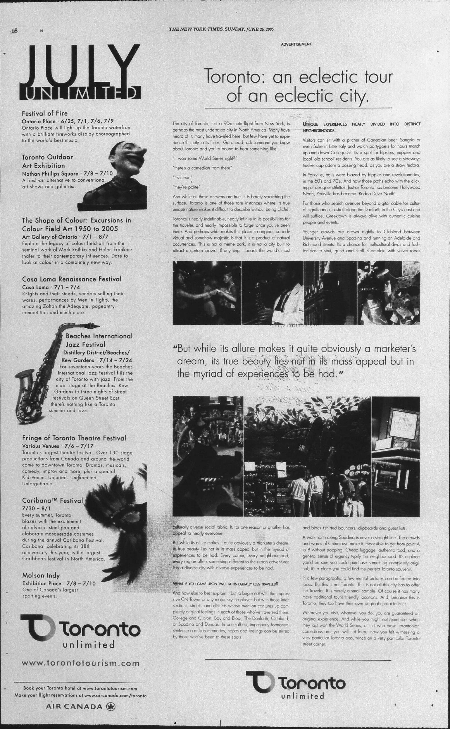
This ad doesn’t stand out in the June 26th issue. The film “War of the Worlds” had a much bigger presence with more ads, and flashier ones.
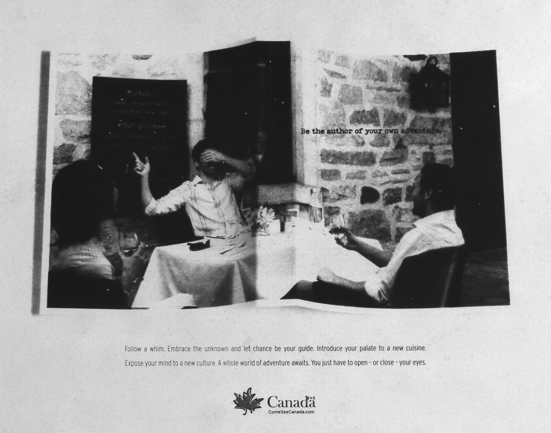
In Toronto’s defence, there was an even clunkier ad for “Canada” in that issue:
Sludge-like advertising copy referred to Toronto as “a product of natural occurrences.”
Toronto Star, Jul. 23, 2005
The terrible new brand drove Toronto designer Errol Soldanha to create the website “Toronto Limited” to discuss aspects of the campaign. What really stung for Soldanha and others was that a New York agency was hired to develop Toronto’s public identity. Were there no Toronto agencies that could do the job?
But… don’t worry, everyone!
The core campaign idea may have been swiped from a group of OCAD students who developed it in Toronto.
You can get a neat overview of the whole fiasco from this Globe & Mail article.
Public reaction was tepid. Personally, I remember seeing the “baloons” ad in the Toronto subway and thinking they resembled spermatozoans. The Urban Toronto forum participants delivered some real zingers after the campaign launched:
They look like ads for a pharmaceutical company, selling a variety of prescription antidepressants.
nasty font – I first read that as Loronto (for some reason), then Joronto then Toronto finally.
It’s simplicity and lack of real explanations encourages people to find out more. I don’t think what Toronto is or the essence of Toronto can be shown to people, it has to be found.
(This one is genuinely sweet. That’s just not how advertising is supposed to work.)
The logos remind me of 1960’s municipal architecture.
Flash forward 19 years after the “very Toronto” misadventure of Toronto Unlimited:
I was chatting with a colleague (hi JB!). He was about to travel to Toronto for our on-site and he left sightseeing plans until the last moment. I joked that our city motto is “Toronto: It Sneaks Up On Ya!“
And then I remembered – we had a real-life motto that was just as bad. “Toronto: unlimited”. But I couldn’t find an example of the logo. Nowhere in Google Images or Google search. Did I dream the whole thing? Am I actually an Alzheimer-addled Uzbekistani septuagenarian who’s hallucinated a whole life as a Torontonian? (JB, if you can hear me, send help!)
It felt like the whole episode was wiped from the Internet
I put my sleuthing skills to good use and compiled what archived data was available into this page. So that everyone may know: no matter how badly you messed up at work today, it’s still nowhere as bad as
P.S.
I got a kick from knowing that, when it comes to Toronto Unlimited, I’m on the same page as JT Singh – the mastermind behind Pyongyang’s tourism brand.

Postscript
A Redditor brought to my attention Ottawa’s old tourism slogan:
Ottawa: technically beautiful
$200,000 went into developing this slogan. And with feedback like “If I called my daughter technically beautiful, she’d hit me.” I have to say that this one is worse than Toronto’s.
Another honourable mention is New Brunswick’s old license-plate slogan:
“Be … in this place”
When it comes to the Branding world, the people doing Tourism Branding are wading in the kiddie pool compared to the people doing Pepsi’s “Grinning Idiot Rebrand” – who are plunging into the ocean’s abyss.
